
Designing banner ads isn’t easy. You have a limited amount of space, and people are likely to only glance at the ad for a few seconds at most. There are even some misconceptions whether they are even effective for modern marketing. With these constraints in mind, you need to grab their attention and compel them to take action. In this post, we’ll be giving you tips to get you started with designing banner ads and show some examples to illustrate our points.
Here are tips for designing banner ads for beginners:
What to setup before designing banner ads
Before you start designing, there are a couple important things to know: what dimensions your ad needs to be, what file type it should be saved as, and what the maximum file size for an ad is. Without this knowledge, you might make a great ad that isn’t able to be used!
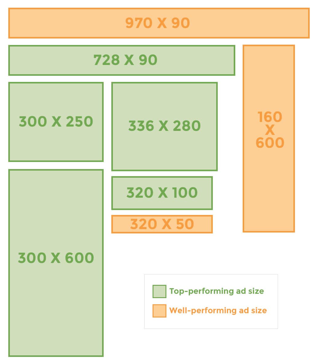
Banner Ad Sizes
Some banner ad sizes are more successful than others. Here are the top performing ad sizes, according to Google:
- 300×250 (medium rectangle)
- 336×280 (large rectangle)
- 728×90 (leaderboard)
- 300×600 (half page)
- 320×100 (large mobile banner)
Other well-performing banner ad sizes that didn’t make the top list are:
- 320×50 (mobile leaderboard)
- 160×600 (wide skyscraper)
- 970×90 (large leaderboard)
File Size and Format
Google’s maximum file size for banner ads is 150kb. Non-animated ads must be in one of these formats: GIF, JPG, PNG, SWF, ZIP. If your banner ad is animated, it must be a GIF.
What content should be included when designing banner ads?
Your ad should contain three pieces of information including your logo or branding, your message, and a call to action (CTA). These three components will give the viewer everything they need to know – who you are, what you’re promoting, and what to do next. Each of these components is essential to include in your ad, and missing any one of them will make your ad less effective.
Logo/Branding
It is important for someone looking at your ad to know who is advertising to them. Your logo should be clear and readable, but not huge, or the only part of the ad. Your message and CTA are just as important as who you are.

This ad is for the company Swimsuits For All, but if you aren’t familiar with the brand, you might think that “Swimsuits for all” is the message, and have no idea what brand the product in the ad is from. Your logo (usually) shouldn’t be the focus of the ad.
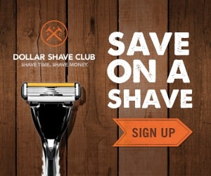
This ad for Dollar Shave Club has good balance: the logo is readable, but not the center of attention and the emphasis is on the message and the CTA.
Message
Try to get your point across in as few words as possible. Remember: you have a limited amount of space, plus a limited amount of time that people are going to be looking at the ad. Too much text will make your ad feel crowded and overwhelming, plus it will take longer to read. You want people to understand what you’re promoting as quickly and easily as possible.

There is a TON of unnecessary text here. Transforming the text into a short, bold statement would be a great improvement.

You don’t need to give away all of the information about what you’re promoting. If you leave the viewer curious or with questions, they may be more likely to click.
Call to Action
Always include a CTA in your ad. If you don’t, even if someone is intrigued by your ad, they have no next step to take. When they do take that next step and click on the ad, send them to a landing page.

Although this ad is beautiful, it has no CTA. It is still good for brand recognition, but is less likely to prompt viewers to take action and click.

This ad for an airline prompts the viewer to “Book Now”, giving them a next step to take. This CTA could be made even more effective by making it a button instead of just text.
Simplicity is key when designing banner ads
In most design situations simplicity is more effective, but it is especially true with banner ads where space and viewing time are limited. By using a limited color palette, including only one or two clear and easy-to-read fonts, and having a maximum of one image, you can create clear and concise ads. This will allow your ads to be easier and faster to understand.
Colors
Stick to a small color palette so that your ads aren’t overwhelming. Also, use colors that match your logo, website, or other marketing materials. Doing this will create consistency for your brand.


Both of these ads are for the game Minecraft. The top ad features a lot of bright colors which sort of clash and are overwhelming. The bottom ad is still colorful, but it sticks with a slightly muted color palette, which makes it feel more cohesive.
Fonts
Use only one or two fonts or font variations in your ad. Don’t use cursive fonts or other fonts that are hard to read. Additionally, be sure to use proper font spacing so that the text doesn’t feel crowded.

This ad has a lot of different font styles, which makes it lack consistency. They also use all uppercase lettering in the bottom disclaimer, which makes it seem cramped.

This ad seems more cohesive in terms of font choices. There is one font used in three colors (white, black, and red), and they use all uppercase in a way that makes sense.
Images
If you’re going to use images in your ad, it is usually best to stick to just one. Because of the small space, showing detail can be difficult, especially if you’re trying to show multiple objects. For example, if you are a clothing brand, show one piece of clothing from a collection instead of the whole collection.

Here, Vicks is showing several of their products in one ad. This gives a viewer no particular thing to focus on, and it’s hard to see what each individual product is.

This ad is much more focused, since there is information about only one product. You can also see more details of the product, since it’s the only image featured in the ad it can take up more space.
Get inspired by these banner ad designs
All of the examples here were found on Moat. Using their ad search, you can view ads from just about any company you can think of and get inspired to create your own!
Overall, when designing banner ads you need to think outside of the box to really grab the attention of potential leads. Following these tips, you’ll ensure that your banner ads are effective and bring in targeted traffic and leads. What banner ads tend to grab your attention? Let us know in the comments!