Landing pages are designed to get your customers’ attention and pull them toward a specific action. But not all landing pages are the same. Who this customer is and what action you want them to take will decide how the page looks and functions. We’ve scoured the internet to bring you lead-converting landing page templates for the most common types of offers. We’ve also broken them down to show why they are effective, and how you can duplicate them for your own campaign.
6 Lead-Converting Landing Page Templates and Why They Work
1. Free Trial Landing Page Template: Basecamp
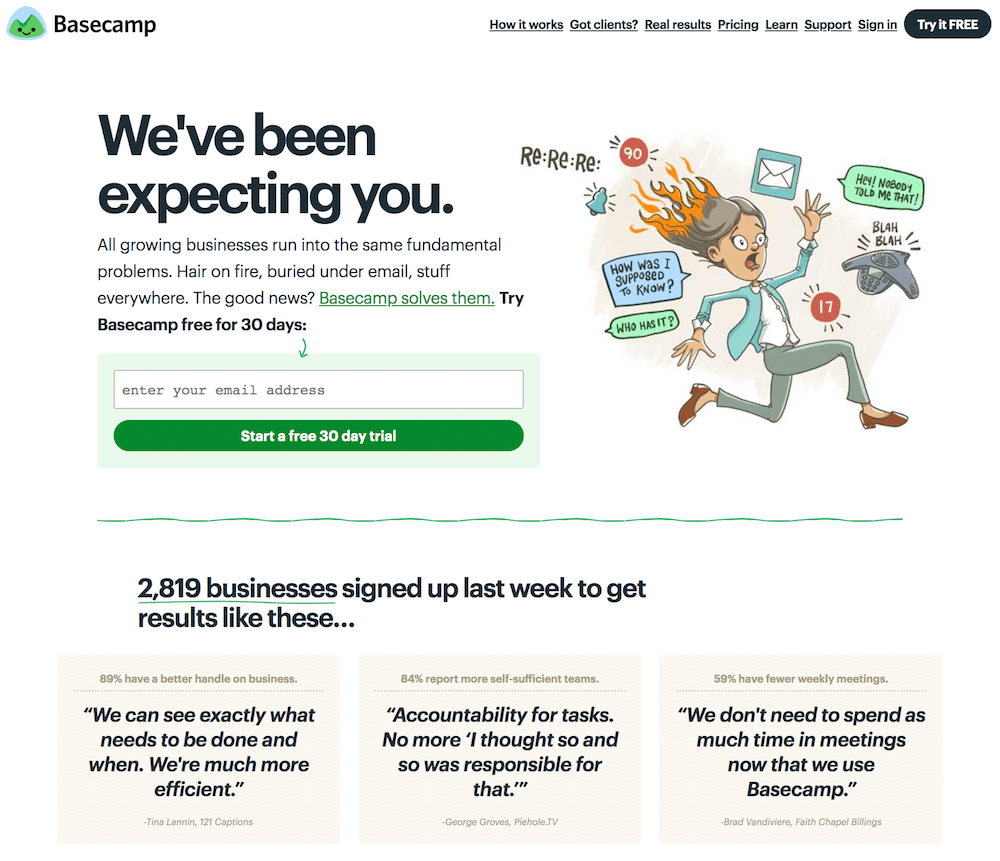
Basecamp creates an approachable and highly-effective free trial landing page template.
The free trial landing page is the mainstay for SaaS businesses. Basecamp, a team- and task-organizer, uses famously fun, memorable, and attention-grabbing free trial landing pages. Their brand and style is clear in this page; the amusing illustration shows that Basecamp is approachable, friendly, and wants to help. The unorthodox heading, “We’ve been expecting you,” brings visitors straight into the page copy. The next short paragraph presents Basecamp as a solution for office chaos, and offers a free 30-day trial. This first section is all viewable without scrolling (AKA “above the fold”), and it succeeds in its mission: present the offer in a clear, compelling way.
This first section isn’t the only thing that makes this landing page successful. Basecamp also provides social proof with the text, “2,819 businesses signed up last week…”. The page then provides direct quotes from customers. This creates quantifiable proof with a specific number, as well as qualitative proof with testimonials. All of this together makes a 30 day trial seem like a pretty good idea. And why not? The short form requires only an email address, so there’s almost no barriers at all.
2. Narrow Targeting Landing Page Template: Sprout Social
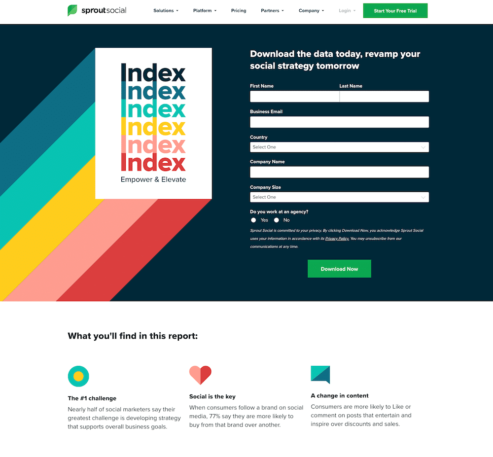
Sprout Social’s downloadable report landing page targets only serious leads.
Not all leads will become customers, and it takes time and energy to sort them out. Adding qualifying questions to your landing page will help you narrow your targeting. You’ll get less leads, but ideally higher conversions.
Sprout Social, social media automation and analytics software, created an exemplary landing page template for narrow targeting with their downloadable guide. With a six-question form, it’s going to weed out a lot of casual readers and attract more serious marketers, who are their ideal audience. Though the cover of the guide is a little lackluster, the eye-catching colors and complementary overall color scheme succeed in attracting visitors’ attention.
Though the form is longer, the rest of the landing page is short and sweet. Three bullet points, still maintaining the color scheme, briefly explain what the downloadable content is about, and how it can help marketers. Underneath those points are explanations of previous reports, so visitors can find what they’re looking for if this report isn’t it, or so they can get a better idea of the information Sprout Social provides. All in all, it’s a clean, professional, but eye-catching B2B landing page for narrow targeting.
3. Multiple-Step Landing Page Template: Vrbo
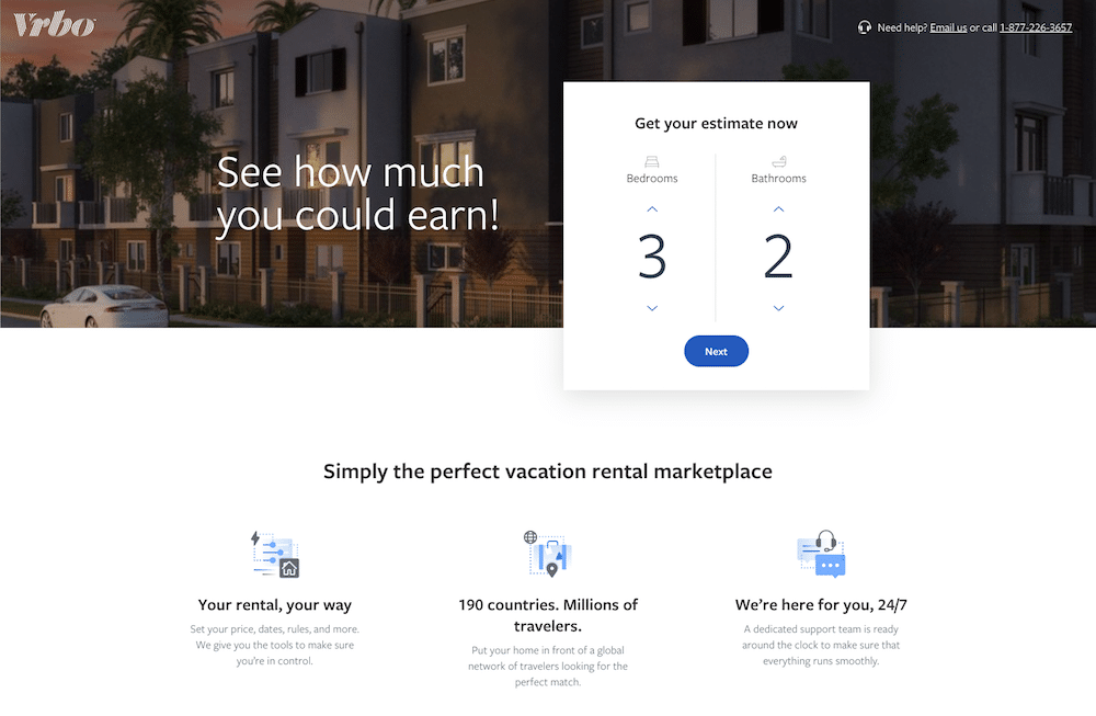
Vrbo breaks a long process down into short steps to increase conversions.
The multiple-step landing page combines the previous two landing pages, allowing businesses to gather more information on their leads without driving leads away. This landing page breaks longer forms down into a series of quick questions. Addressing questions one at a time, step-by-step generally increases lead conversion over a single long form, which will drive many potential leads away on-sight.
Vrbo, a beach vacation booking site, accomplishes this through quick and easy steps with lots of white space, and creates a stand-out multiple-step landing page template. Listing a beach property on the site requires a lot of information, and Vrbo made several smart decisions to increase conversions. First, they focused on the information that property owners probably want to know first; how much they can earn by listing their property. Then, they divided up the necessary questions into steps, creating a better experience than one long form. Finally, they provide advantages and simple instructions on the page to explain and convince but, again, not overwhelm.
4. Professional Event Landing Page Template: Electro-Matic
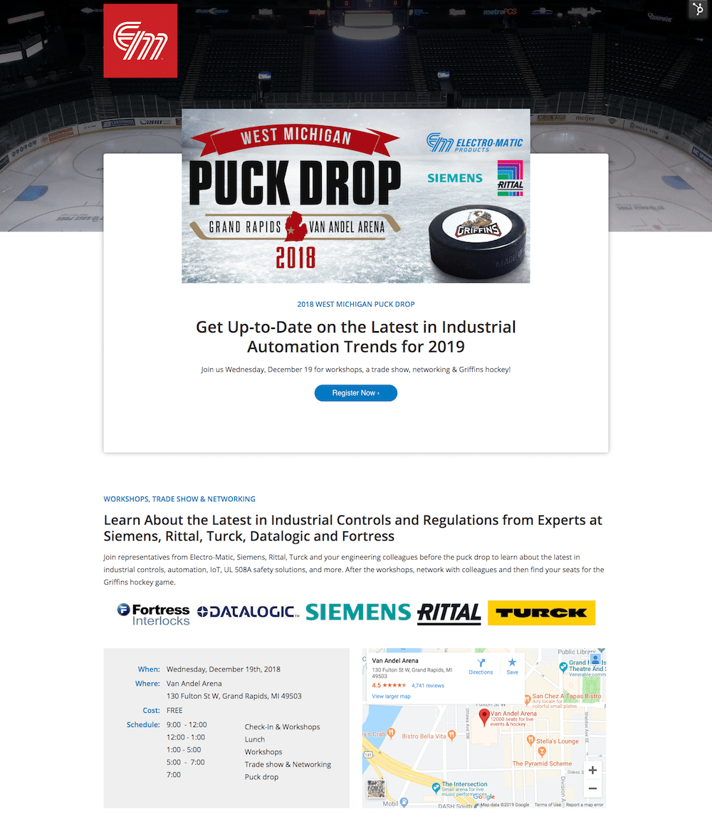
Electro-Matic maintains a professional style while creating interest with this event landing page template.
It can be tough for professional event landing pages to stand out. Working with the strictly informational style required in many B2B industries can mean fading into the background, yet straying from the style means sacrificing authority and stature. For their 2018 trade show and hockey event, industrial automation manufacturer Electro-Matic highlighted exciting elements while still providing all necessary information. The mix of excitement and professionalism makes this a great professional event landing page template to duplicate for your upcoming event.
The top-most banner immediately explains the event, including both the fun and professional aspects—industrial automation and hockey. A single registration button in lieu of a form keeps the page from overwhelming visitors with information demands. Further down the page, the logos of industry leaders stand out, lending authority to the event. Below, the location and schedule is clearly and concisely presented. With lots of white space, the page is easy to take in and the informational blocks make scanning the page easy.
5. Product Landing Page Template: Daily Harvest

Daily Harvest taps into their target market for the style and design of this product landing page template.
We shouldn’t judge books by their covers, but most of us do, and the same is true for product landing pages. If a product isn’t presented well online, the odds of an online purchase plummet. Daily Harvest, a health-foods subscription service, took appearances seriously for their product landing pages, and successfully tapped into the look and feel their target market wants.
Daily Harvest presents a top-notch product landing page template to use because of their clean, simple, and appealing design. Many product landing pages follow a similar format, but a few subtle elements on this page make it stand out. First and most importantly is the product picture; it’s professionally photographed and arranged, so it looks fresh and delicious. Understanding that a picture of a green smoothie doesn’t say much, Daily Harvest used their ingredients instead to make an impact. Though both images are available, this one appears first. Alongside the picture, product copy that is heavy in verbs and adjectives helps to describe an experience, not just the product. Underneath, a scannable list of benefits and an unmissable black “Get Started” button compel action.
For visitors that still aren’t convinced, the landing page goes on to tackle a buyer’s most likely objections; what’s in it? Is it good for me? A long list of reviews bolster the product’s excellence, proving to any uncertain consumers that many people stand by this product. Surrounded by a clean and simple layout, visitors get the innate sense that the product is pure and healthy.
6. Microsite Landing Page Template: RunHunters
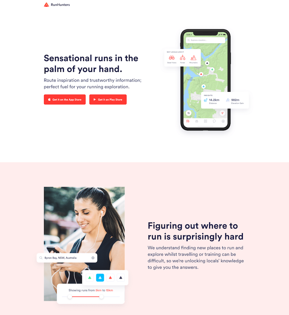
RunHunters explains their app and invites downloads with a clear and simple microsite.
Microsites meet in the middle between landing pages and websites. When you don’t need or aren’t ready for a full-fledged website, but you still want to create buzz around your product or service, a microsite is a good start. Great for apps, soon-to-launch services, freelancers, and books, microsites take visitors on a tour of the product or service using a series of stacked sections. RunHunters, the running and hiking exploration app, provides a great microsite landing page template with an appealing and easy-to-follow design.
The first section invites visitors to download the app straight-away, which is ideal for capturing leads that are already familiar with the product through some other means. Moving further down, the next section presents the problem; “figuring out where to run is surprisingly hard.” The picture alongside shows, with a collection of four simple images, how RunHunters solves the problem. The next sections provide more details and delve deeper into the app, and close with an appealing banner and invitation to their Instagram page. This is great for continuing a relationship with a potential lead who might not yet be ready to download the app.
Best of all, this microsite landing page template looks great on desktop or mobile screens, and it’s about as low-maintenance as you can get. It’s also easy to expand at any time, so it’s ideal for early-launch-stage products.
These are the most common types of landing page templates you’re likely to need for your next campaign. Try customizing or even improving these landing pages by putting your own style on them, or use these as a starting point for giving your designers some direction. Put yourself in your customer’s shoes when creating your landing pages, and don’t forget to test often, so you can make sure your going in the right direction.