
Your brand identity accomplishes many things for your business; it tells customers what your business is like, attracts the attention of your target market, and helps customers remember your business. Your brand identity also helps to guide design decisions, like paint colors for your office, the tone and colors of your brochures, the look and feel of your website, and more. When your brand identity on the web is consistent with your overall brand, it reinforces your image, makes your business more memorable, and helps to attract your target market. Whether you’re building brand identity for a new business or starting a brand refresh, consider these tips for building brand identity on the web. We’ve updated this post to give you even more tips, including design elements as well as brand voice and personality.
7 Design Tips for Building Your Brand Identity
Your brand identity is made up of many different elements. Visually, your colors, fonts, and images all work together to create a mood or motif. The functionality and the overall style of your website and other online assets also contributes to this. Finally, the tone and voice of your written content or videos can also reinforce (or detract from) your brand. When all of these elements work together harmoniously, you can connect more easily with your target market and instill confidence in them before you even make contact.
As you consider these tips for building brand identity on the web, ask yourself what you’re trying to convey to customers, and who you’re trying to reach. Do you want to convey professionalism and expertise? Friendliness and inclusivity? Excitement and fun? Something else? Knowing what you’re trying to say can help you start to hone in on the right look, feel, and voice for your brand.
1. Color
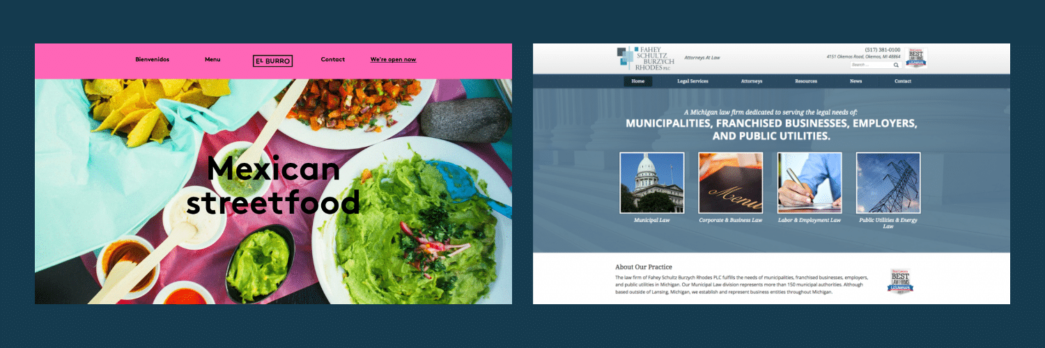
Color has a big influence in the overall brand identity and tone of a site. Bright, saturated colors are exciting while muted, toned down colors tend to have a serious, matter-of-fact tone. This example below illustrates the effect color has on the overall emotion a site conveys. This Mexican street food restaurant’s website color palette is bright, attention-grabbing and fun. The law firm’s color palette is more moderate, with neutral grays and blues lending to a focused, professional tone.
All of your colors should work together. A good understanding of color schemes and the moods they convey can help you choose colors and shades that look attractive together, and elevate your brand. Consider how your different colors complement each other in different ways, including not only the colors themselves, but other elements as well, like saturation (how vibrant the color looks) or value (how light or dark the color looks).
2. Fonts
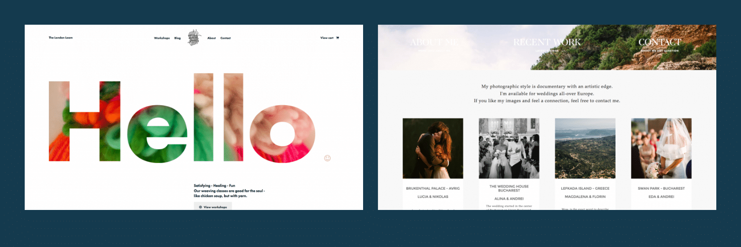
Another way to build brand identity on the web is with typefaces. Will big, chunky fonts be appropriate for what you’re trying to convey or will light, clean typefaces be more inline with branding efforts? The bright, bold font on this loom site lets visitors know they can expect to have a fun time if they take a class here, while a light, minimal font works well on a photographer’s site where the emphasis needs to be on images.
You can probably get a feel for the mood that a particular font portrays, even if you’re not sure exactly why. Features like serifs, font weight, font width, X-height, rounding and many more work together to create the small, yet clear differences between fonts. Consider how an elaborate script-style font can make your text look elegant and detailed, while a heavy, condensed font will make a message seem hard-hitting and urgent. The details of typography can get complex, but it’s generally a good idea to work within a font family for your website and other online assets. This way, you can utilize a bold, attention-grabbing font for your headings, while still using a complementary font for your body copy.
3. Imagery
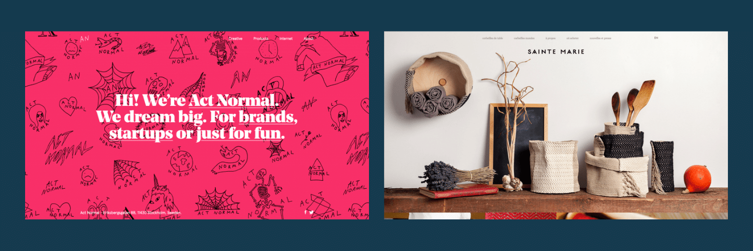
The use of imagery on a site has a major influence on a site’s brand identity. Large photos will present a professional look while icons and hand drawn illustrations are a fun and cheeky approach. The imagery used on your site will tell users a lot about the your company. Once again, consider what you want your website—and the images on it—to say. Do you want images of dreamy landscapes to set a mood of adventure or relaxation? If you own a travel agency, outdoor activity business, or outdoor apparel retailer, then you might. Or, do you want to welcome potential customers and show them the atmosphere of your business using snapshots at ideal times? If you own a restaurant, hotel, or events center, those would probably work well. Or, do you want to spotlight your chic product and show happy customers using it? This is a go-to strategy for all types of products, from smartphones to smoothies to new apps and many more.
Your images will work alongside your color palette and your text, so consider how all of these elements work together to build your brand on the web. If you’re working with image-focused social media platforms like Instagram or Pinterest, you’ll want to pay close attention to the images you use, and be sure that they’re on-brand. Also, consider how users will view these images and whether or not they complement the rest of your content. For example, viewers will naturally follow the gestures and looks of photo subjects, so this can lead them to important headings or paragraphs. Images portraying real people also tend to be more impactful as well. Whatever images you use, they should add to your website and build your brand.
4. Functionality
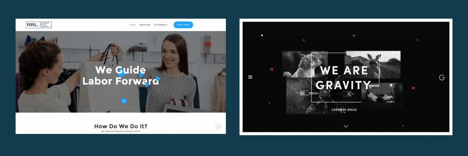
Should your website be traditional and easy to use? Or should it implement new interactive elements to engage users? The way a website functions can communicate to users that your company is classic and established or innovative and exciting. Traditionally, most websites use a top-navigation system with drop-down menus to get around the site and move between pages. However, changing navigation system, using animations, and uprooting expectations can make your website, brand and business stand out as an innovator. Once again, carefully consider what you’re trying to convey. If you’re brand is built on professionalism and tradition, a disruptive style like this might just disorient your visitors. Focusing on building functionality for your website that fits your target audience will help you further establish your brand identity on your website.
5. Overall Style
The combination of colors, fonts, imagery and functionality create the encompassing experience a user will have while visiting a site. Your users’ experience and how your site makes them feel will directly affect how they perceive your brand. Making sure all of these elements line up to create an overall style will help you establish a strong brand identity you can use in other aspects of your business’s message. Before you launch your brand, consider mocking up a few example pages, or asking a professional to do a mock-up for you. Get a list of your fonts, colors, and related images, and play around with them. Then, talk to your target market, ideally your existing customers, and ask them what the mock-ups make them think of. If you’re looking for a professional, experienced overall message, then words like “clean,” “easy to use” or “modern” will indicate you’ve hit the mark. Contrastingly, if you’re trying to convey excitement and interest, words like “bold,” “edgy,” or “colorful” will be better indicators.
6. Voice
In addition to visual and functional elements, it’s also important to consider the text and information you’re conveying. If all of your visual elements work together, but your brand voice doesn’t match it, it will detract from your overall brand. It can be difficult to try and get written elements to match a visual presentation. It’s helpful to again consider what overall mood, tone, and message you’re trying to convey. What is the content of your message? Consider the following to orient your brand voice.
Literal vs Metaphorical
A literal tone explains exactly what something is. A metaphorical tone uses images and comparisons to show what something is. A literal tone is generally less emotional and won’t create a mood, while a metaphorical tone will. Keep in mind that a metaphorical tone can still be professional, but it will be more illustrative. Consider the differences in tone that might occur between a casual restaurant and a modern brewpub. The casual restaurant will likely be literal, explaining what’s on their menu and what visitors can expect. The modern brewpub might be more metaphorical, making comparisons and using adjectives to describe the taste of new beers or food items.
Simple vs Academic
A simple tone uses common, easily understood language and avoids jargon. An academic tone will be more specific, using complex wording or industry-specific terms. While anyone can read a simple tone, and this is generally encouraged for most web writing, an academic tone can be helpful in some instances. If you’re speaking about a complex subject to a knowledgeable audience, an academic tone will demonstrate your experience and authority, while a simple tone might detract from it.
7. Personality
While your brand voice is concerned more with what you are saying, your brand’s personality is more concerned with how you say it. With slightly different wording, the same information or message can be conveyed in dramatically different ways. Your brand image, style and voice may all match, but your brand’s personality can still tilt or skew the overall brand if it isn’t correct. Consider the following aspects of your message to hone in on your brand’s personality.
Respectful vs Irreverent
A brand with a respectful overall tone is generally welcoming, friendly, and positive. This brand wouldn’t use language or make statements that could offend or turn off potential customers. This brand also wouldn’t put down competitors or contrary approaches to their business. A brand with an irreverent tone shirks conventions, traditions or expectations. They might use sarcasm, sharp humor, or slang to connect with their target audience and demonstrate that they are like-minded. An irreverent tone can be impactful, but tricky, as it can easily become offensive. Consider the differences in tone that would probably occur between an art gallery and a tattoo shop. A sharp, sarcastic or rebellious tone would be confusing for the art gallery, but might be compelling to the tattoo shop’s customers.
Professional vs Casual
A casual brand speaks and writes to the target market as if they were a friend. It’s inviting, may use some slang, and feels conversational. A professional tone creates distance between the business and the audience, though it can also create authority and respect. A professional brand personality does not have to be overly academic or complex, but it won’t use emotional language, heavily connotative wording, or slang. Consider the differences in tone that would occur between a B2B auto manufacturer and a auto detailing shop. Though they deal with similar products, the B2B manufacturer would benefit from a more professional tone, while the auto shop would benefit from a more casual tone.
Your website is one of many opportunities to showcase your company to potential clients. Having a consistent brand identity across all of your marketing platforms, including your website, will create continuity and help establish your brand. Using web design elements like colors and imagery as well as written elements can help tell your company’s story and build brand loyalty.