
Just starting to learn about graphic design or typography? Working with a designer and want to sound really smart? Trying to polish your website design? Then this blog post is for you! I’ll outline the basics of typography for web designers that you can use to build a cohesive brand identity in web.
Serif and Sans-serif Fonts
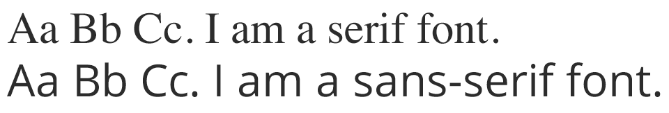
Let’s start off easy. If you know anything about the basics of typography, you probably know the difference between serif and sans-serif fonts. As you can see below, serif fonts have little ticks (those are the serifs) at the ends of the letters. Sans-serif fonts lack these (“sans” means “without”).
When should I use serif and when should I use sans-serif font?
If you’re creating print material, such as a book, newsletter, or newspaper, you’ll likely want to use a serif font for your body copy. Because we’re used to reading the shapes of words as a whole, serifs help us to find the shapes of words more quickly. This is why the text in books usually uses serif fonts.
For digital media, it’s mostly up to you. Several studies have been done on which font type is easier to read digitally, and most find that there is no difference when the fonts are simple and straightforward (ornate fonts do take longer to read). If you’re looking for a font pairing for your website design, check out our blog post: Typography Basics: Pairing Fonts for the Web.
Leading, Tracking and Kerning
Leading
When you increase leading, you are increasing the space between lines of text. You might know leading by a different name: line spacing. You have probably had the most experience with this in Microsoft Word documents, where you can set the line spacing to be single, double, or somewhere in between.
To adjust leading in CSS, you would use the line-height property:
p{line-height:100%;}
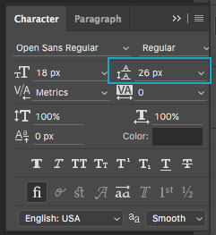
You can also adjust leading in Photoshop in the Character panel:
Tracking
Tracking adjusts the space between letters in a font. Unlike kerning (see below), tracking applies the same amount of space between each letter. Adding tracking can really add some personality to the fonts in your designs. For some real-world examples, check out this post on creating a logo for the web.
In CSS, you can adjust tracking with the letter-spacing property:
p{letter-spacing:2px;}
In Photoshop’s Character panel, you can adjust tracking like so:
![]()
Kerning
Kerning controls the space between two individual letters. This is very similar to tracking in that you are adjusting space, but you are doing it to individual letters rather than applying the same amount of space to each letter. Kerning is mostly used while designing a font, logotype, or poster headline.
There isn’t a way to adjust kerning with CSS, but you can use javascript libraries such as lettering.js to get the job done.
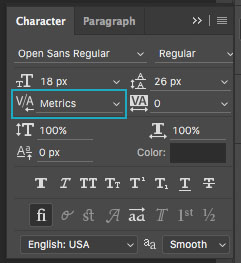
To adjust kerning in Photoshop:
Side note: I found this fun little game called KernType where you can try to kern letters in a word given to you and see how well you do it. Give it a try! A little bit of practice adds up to have a better eye for composition and kerning your own headlines.
Typography Basics: How to Pair Fonts for the Web
The look and feel of a typeface can sometimes communicate a message to someone just as much as the words and sentences they spell out. This makes choosing the right font important when it comes to selecting fonts for any design, web or print. It’s especially important when selecting multiple fonts for a project. Each typeface has its own voice that can get drowned out if paired with a font that competes or conflicts with it. We’ll take a look at the challenges of font pairing for web design and some of our favorite font match ups.
Services like Google Fonts give designers hundreds of fonts to choose from for their web projects. With so many fonts to select, it’s more important than ever to carefully consider the message you want to convey with the typefaces you choose. The right font pairing can create unity and make a design successful.
How to Pair Fonts for the Web: Serif and Sans Serif
Although we’re all about creativity, sometimes less is more. The idea is to create visual interest without becoming busy or establishing conflict. So when it comes to choosing multiple typefaces, we usually stick to no more than two. For example, we like to use serif type as a header and pair it with an easy-to-read sans serif for body.
You also want to select two fonts that create enough contrast without clashing with one another. Pairing two serif fonts or two sans serif fonts together can sometimes disrupt consistency and create awkwardness in a design.
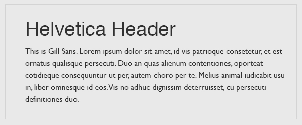
The above fonts are two different sans serif fonts with two different classifications. Helvetica is a neo-grotesque typeface that has minimal contrast in letter stroke width while Gill Sans is a humanist type with lots of stroke width contrast. They are similar enough that an untrained eye couldn’t tell the difference, yet together they create an awkward tension.
Try Differing Weights and Styles
One of the easiest ways to add variety to a design while still maintaining harmony is to stay within a font family and use differing weights, styles, and sizes to add contrast. One of our favorite fonts to use here at Web Ascender for web projects is “Open Sans.” It’s a beautiful font that has great readability for body copy. It also comes in 10 styles so it’s easy to create contrast and interest using the varying font weights.

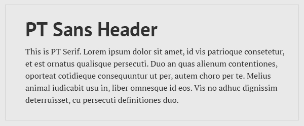
Some typefaces are designed to be completely different styles with similar attributes so they can be paired together. For example, PT Sans and PT Serif are two very different fonts, yet they work well together because they have similar weights, x-heights, and stroke contrast.
7 Examples of Great Font Pairs for the Web
Understanding the basics of what makes a good font pairing can create unity in a design. It’s important to remember to pair fonts with enough contrast to add visual interest yet similar enough to create harmony. With that being said, there are no definitive rules when it comes to pairing fonts. You’ll never know how it looks until you try it! Check out some of our favorite examples below from Google Fonts. Try them on your next project, or create your own.
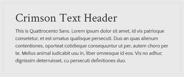
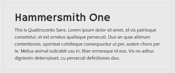
1. Hammersmith One and Quattrocento Sans
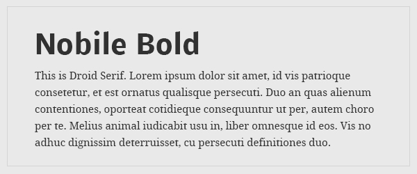
2. Nobile and Droid Serif
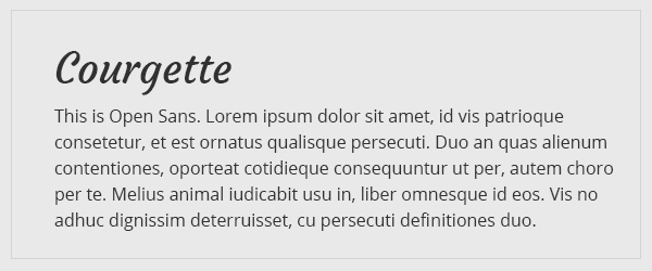
3. Courgette and Open Sans
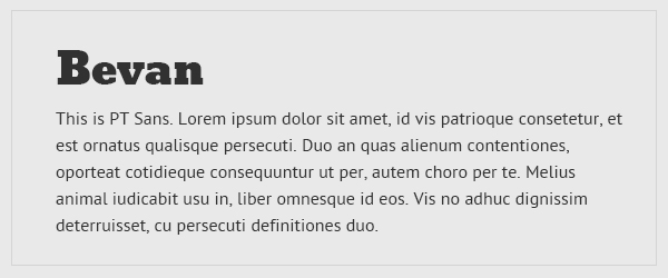
4. Bevan and PT Sans
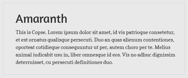
5. Amaranth and Copse
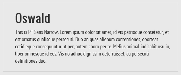
6. Oswald and PT Sans Narrow
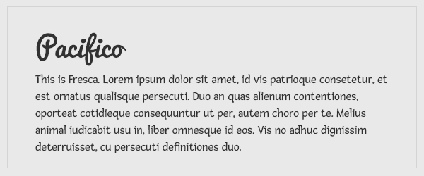
7. Pacifico and Fresca
Want more?
Typography is an important part of design, and having some technical background can help you be more informed about the choices you make in your work. If you want to learn more than the basics of typography, fonts.com has a “Fontology” section on their site where you can learn a ton about fonts, including font history, how to effectively use fonts, and more.