When it comes to the content on your website, what you say can be just as influential as how you say it. Your text is written and the message is ready to be published, but what fonts will best compliment your brand?
Just like graphics, photos, and color palettes, the typography on your site can be used to convey tone and personality. Choosing the right font can have a major impact on your website and deserves careful consideration. So how do we define what fonts work best when designing a site?
Here are the Steps we Take When Choosing the Right Font for Your Website
Considering Tone and Message
The fonts on your site can make a big impression on others. It helps to think about font selection the same way you would consider picking out an outfit. Would a formal suit and tie work best for the situation? Or would something more casual and laid back be a better option? You wouldn’t wear your gym shorts to work or put on your dinner party attire for the beach, so it’s equally important to choose fonts suitable for the message of your site.

The site on the left uses a modern, light sans serif while the site on the right uses a bold display font with plenty of texture
Just like an outfit, the fonts on your website should not only be appropriate but should also be a reflection of who you are. Will a clean, sans-serif font portray the qualities of your brand? Or would something bold and off the wall be more appropriate? We carefully consider the qualities of your brand and try to select fonts that best complement your message.
Defining the Audience
Who you’re talking to is also an important factor to consider when we choose fonts for your site. What is the ideal age of your target audience? What gender do you typically reach out to more? What professions are they in? All these can influence the fonts we use on a site.
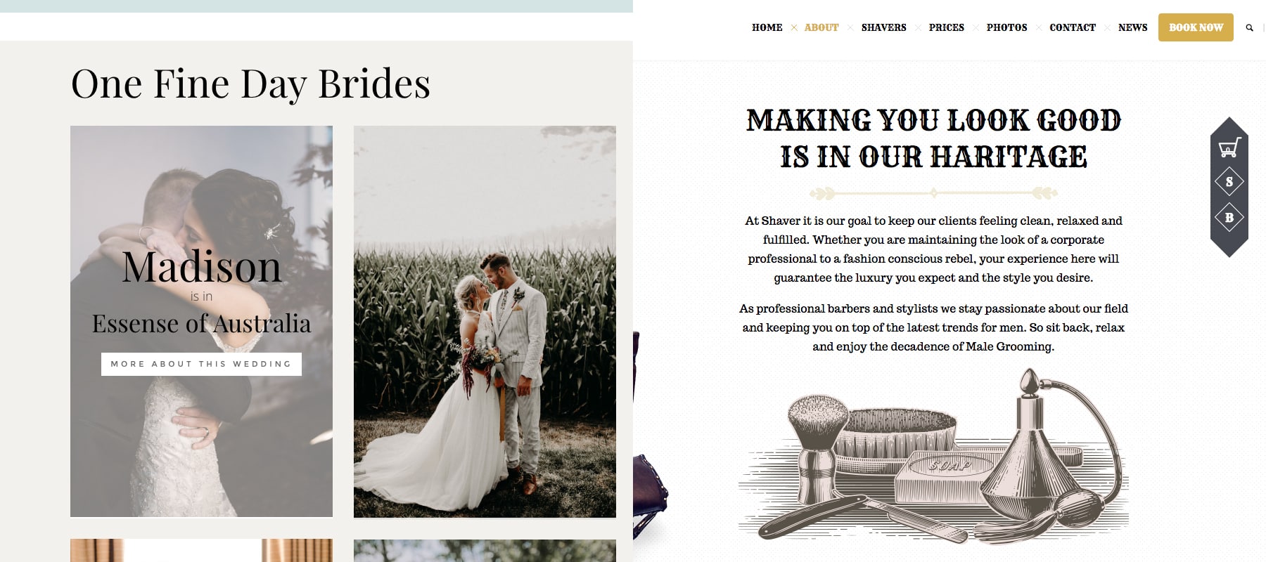
A light, decorative font might be appropriate for a bridal boutique while something bold and impactful might be better suited for a barbershop.
Determining the Readability
No matter how well thought out and carefully crafted your content may be, it won’t do you any good if the fonts on your site can’t be easily read. Font size, letter spacing, and line height are all things we take into consideration when ensuring the fonts we select are readable.
When selecting a font for the body copy, clean and simple is often better. Easy to read serif or sans serif fonts tend to work best for paragraphs. Display and script fonts are better for larger headlines, as long as it can still be read at a quick glance.
Creating Complimentary Font Pairings
A site with just one font might be boring and lack visual hierarchy, while a site with too many fonts could be distracting and void of cohesion. When selecting fonts to pair with each other, it’s important to consider how well they compliment each other. There are a couple guidelines we follow when deciding what web fonts work well with each other.
Sharp contrasting fonts: Two bold fonts with strong personalities might compete for attention on your site, so it’s best to pair a more distinctive font with a font that’s more conservative and clean.
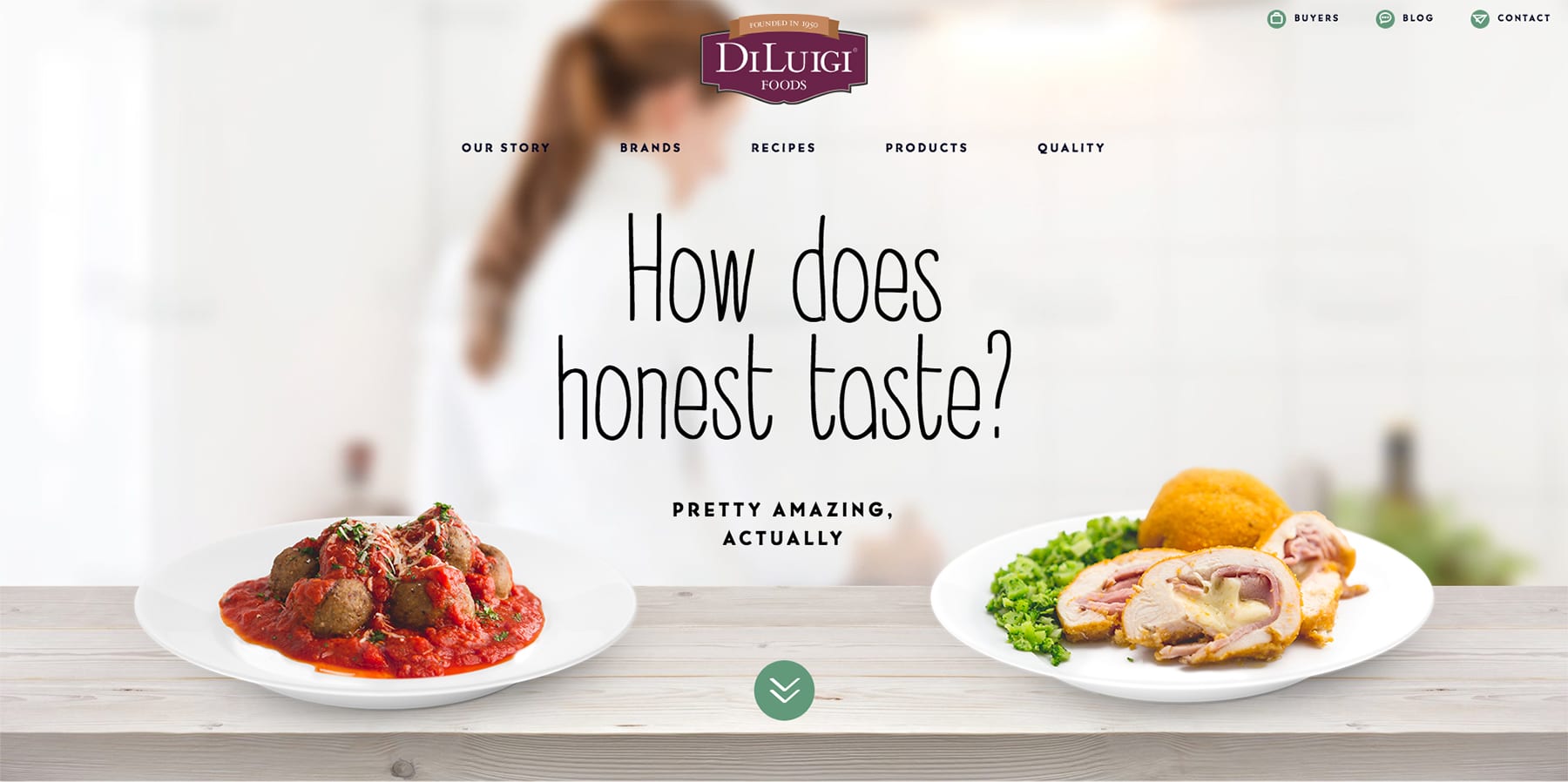
The charming hand written header text is a sharp contrast to the simple sans serif font used throughout the rest of the site
Fonts in the same family: Yes, a site with just one font can be boring, but using the same font with various weights ensures there is enough contrast between the headers and body copy while staying cohesive. We like to use bold font weights for headers and regular or lightweight fonts in the same family for body copy.

Even though different weights are used, the font family is still the same
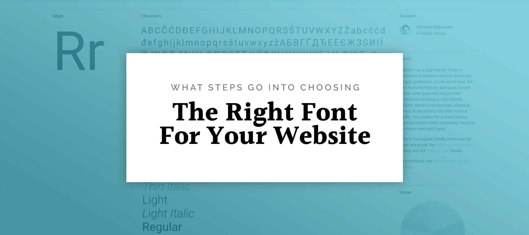
Font Superfamilies: Some fonts come in both serif and sans serif and are similar enough to pair well with each other while offering enough contrast to keep things visually interesting.

This site uses a combination of Roboto Slab Serif and Roboto Sans Serif
While there are no hard rules when it comes to creating font pairs, we typically stick to two or three fonts to keep things from too getting busy.
Conclusion
The fonts selected for your can be just as influential in conveying your message as the graphics and colors on your site and have a major impact on your branding efforts. There are a handful of things we consider when selecting the fonts for your site including your brand’s voice, target audience, readability, and font pairs. What are some of your tips for choosing a font? Share them with us in the comments below!