
More searches are now made on mobile devices than computers. Google’s introduction of the mobile-first index proves that mobile optimization is a priority, and a valuable marketing opportunity.
Google’s push for mobile-friendly optimization isn’t new, however some of the most significant mobile search results changes have only been publicly released in the last year. Introduction of the mobile-first index, a list of sites given priority in mobile search results, began in December. The first to seize these advantages will win top mobile search spots in their industries, while those that ignore mobile marketing trends will be left behind.
But what is the mobile-first index? And how can you be the first to use these mobile marketing opportunities?
The Mobile-First Index and Must-Haves in Mobile Marketing
The Mobile-First Index
Google creates an index of all known pages and sites in order to generate search results. Up until recently, this index was primarily for pages designed to appear in your laptop or desktop. The mobile-first index looks just at pages optimized for mobile search
You can immediately see when a page is perfect for your phone; it’s clean, easy to read, and easy to navigate. Pages and sites in the mobile-first index are considered more useful to mobile users, thus appearing higher in mobile search results. This presents a valuable mobile marketing opportunity for great sites to get an extra push into the top results, especially if competitors are slow to adapt.
If your site isn’t ready for mobile viewers, don’t panic. Though mobile-first indexing has started, it’s a gradual process. Here’s what you need to know;
- If you have a responsive site or a dynamic serving site, you should be good to go.
- AMP (more below) are ideal for the mobile-first index, and may get special treatment.
- Content and markup configurations should be similar on mobile and desktop sites.
- Verify both your mobile and desktop sites with Google.
- Use Google’s tools to make sure your site is mobile-friendly.
AMP: Accelerated Mobile Pages
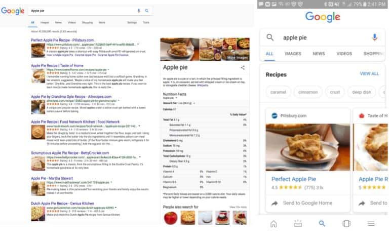
AMP may win carousel spots like that in the mobile SERP for “apple pie” (right), which don’t appear in desktop SERPs.
The mobile-first index is a collection of pages preferred for mobile search results, and Accelerated Mobile Pages (AMP) are the best of the best. While still providing valuable content (Google frowns on mobile pages that sacrifice content), AMP are leaner pages perfectly designed for mobile searches. AMP are preloaded on a Google cache, so they appear instantly on smartphones, which makes users happy, in turn making Google happy.
Besides earning high priority, AMP get special privileges, like showing up in “carousels” at the top of search engine results pages (SERPs). Since results in the carousel stand out from normal results, this is considered SERP position zero, the most clicked and most coveted mobile SERP spot. You may have noticed these carousels when you search certain items on your phone, but you don’t see them when you search the same items on your desktop.
Making an AMP requires intermediate knowledge of web construction, HTML, markup and metadata. The AMP guidelines give you a template, do’s and don’ts, tutorials, and guides to get started. If you want to dominate mobile searches but you’re not ready for the technicalities, ask an expert to help.
PWA: Progressive Web Apps
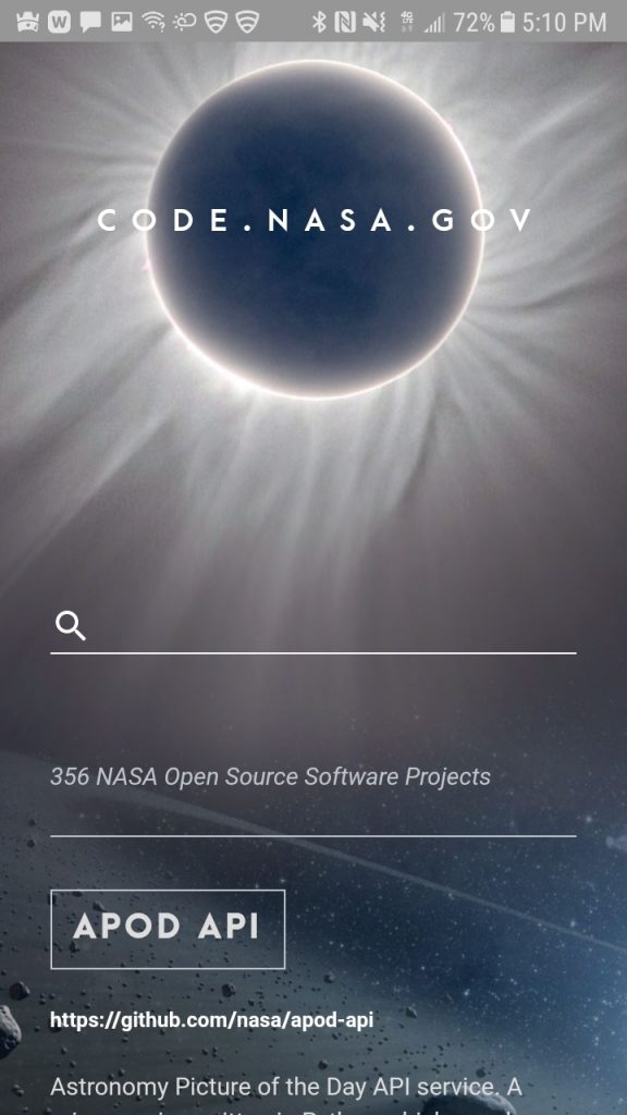
A mobile screenshot of NASA’s PWA, code.nasa.gov
If you’ve ever visited a mobile-unfriendly site on your phone and rolled your eyes at the prompt to “download the mobile app,” you’ve already wished for a Progressive Web App (PWA). Why can’t the site itself just work on your phone? PWA do.
PWA are a web app and web page hybrid. PWA look, feel, and act like apps, but they’re available on a SERP. They can even find a cozy corner of your screen if you want to access them like you would an app. The above mobile page from NASA is a great example of a PWA; it looks and works like an informational app, but shows up in a mobile SERP like any other page. Where AMP is the single-page mobile solution, PWA is the site-wide solution.
While you can build your own PWA, it requires HTML, CSS, and JavaScript knowledge, which might be better left to the experts. Though there is some start-up labor involved, PWA will put your site at the forefront of mobile marketing.
PWA, AMP, and the mobile-first index will all work closely together, and they will all be integral to the mobile overhauls expected for 2018 and beyond. These also present big mobile marketing opportunities for first-adopters. The first to adopt these mobile evolutions will not only win top spots in mobile search results, but also the love of an increasing number of mobile users.