If you find that users aren’t sticking around your website and bounce rates are high, you might be wondering what you’re doing wrong. It can be difficult to strike a balance between the strategies that help users make a purchase or convert and strategies that keep users on the site. In some cases, your users might simply be annoyed. There are a few tactics that can annoy web users fast, and cause them to click away fast, too. Let’s take a closer look.
9 Ways Your Website Annoys Your Visitors
Many website issues aren’t immediately obvious. In many cases, it’s not even a single major problem, but rather a collection of smaller decisions that create friction for visitors over time.
These points of friction can affect how long someone stays on your site, how easily they find information, and whether they ultimately take action. While each issue may seem minor on its own, together they can have a measurable impact on engagement and conversions.
If your website isn’t performing as expected, it’s worth taking a closer look at the user experience.
How Do I Know If Users Are Annoyed at My Website?
First of all, how do you know if your users are annoyed or not? Often, web users are clicking around for answers quickly, and they might not be annoyed at all, they simply might not be finding what they’re looking for. However, there are a few signs that can show that your visitors are clicking away because they’re fed up.
Annoyance Metrics: Bounce Rates, Dwell Times, Time on Page
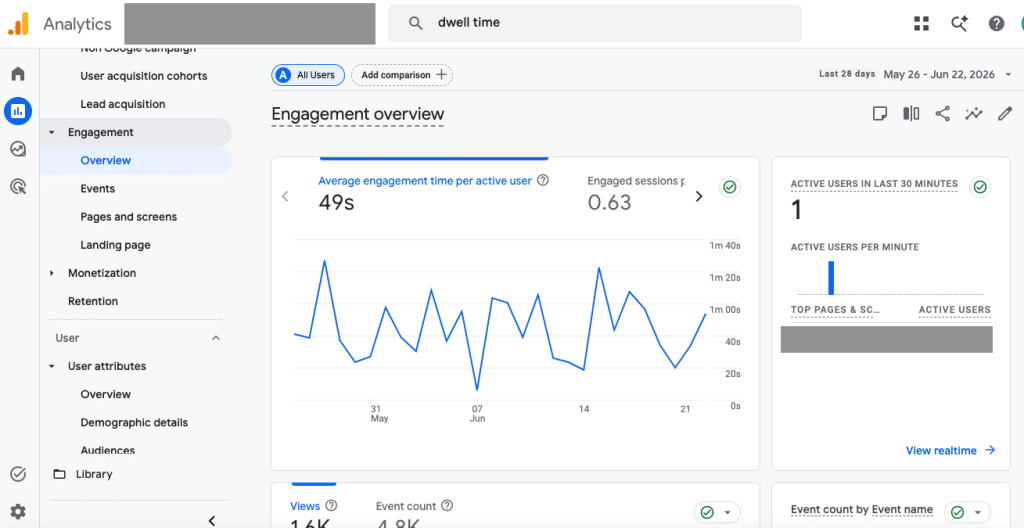
The engagement area of Google Analytics can give you additional insights about how users are enjoying—or not enjoying—your site.
High bounce rates and low dwell times are two metrics to start with. Bounce rates measure a lack of activity on your site; users get to a page then go somewhere else quickly. High bounce rates usually mean that users are clicking away from your site without taking any other action, engaging in any way, or even reading your content.
Dwell times measure the amount of time that a user spends on a page before clicking back to search results. Similarly, you might also look at your website’s average time on page or time on page metrics for any given page. As the name implies, this metric measures how much time users spend on a page. If your average time on page metric is low, especially if it’s less than a few seconds, it’s an indicator that users are getting annoyed.
User Testing
Another way to see if your website is annoying or frustrating your users is with user testing. This doesn’t have to be complicated; talk with a few friends or colleagues, and ask them to click around on your website. If these people are likely to fall in your target audience segment, that’s even better. It’s best if they haven’t used your website before or aren’t overly familiar with it.
As your users click around, consider recording the session, so you can analyze how they’re navigating your site. Ask a few questions or give them a few directives that you might want other users to do. You might ask your testers to try making a purchase, filling out a contact form, or researching a particular topic. Resist the temptation to give them instructions. Let them click around naturally. Afterwards, ask them about how they felt as they did. If they found certain features to be annoying, distracting, or unfamiliar, it might be time to make changes.
1. Pop-Ups That Appear Too Early
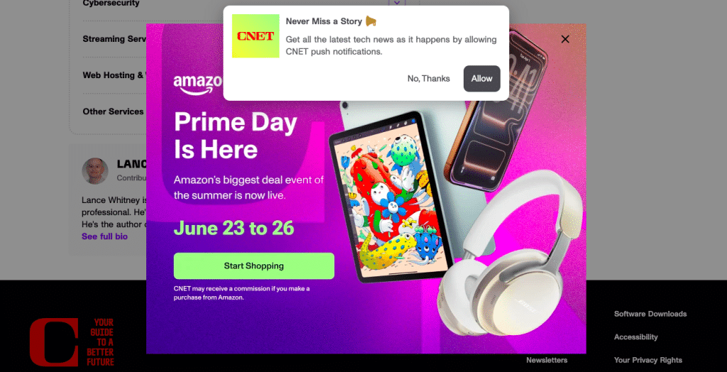
Ironically, this informational post about the inventor of pop-ups apologizing for his invention has two layers of not-so-thoughtfully-placed pop-ups.
Pop-ups can be an effective tool for capturing leads or promoting specific actions, but it’s important to use these carefully.
When a pop-up appears immediately after a visitor lands on a page, it interrupts them, which can be annoying. At that point, the user has not yet seen enough value to justify engaging with the request.
A more effective approach is to delay pop-ups based on user behavior. For example, triggering a pop-up after a visitor has spent a certain amount of time on the page or scrolled through a portion of the content allows them to engage with your site first. Exit-intent pop-ups can also be useful, since they target users who are already preparing to leave.
Pop-up should align with the page the user is viewing to ensure it feels relevant rather than disruptive. Most users don’t like pop-ups; this effect is so well-known that the man who is credited with inventing the pop-up ad has publicly apologized. These can be helpful in some cases, but use pop-ups with caution!
2. Autoplay Video
Video can be a valuable way to communicate information quickly, but autoplay features often work against that goal. Automatically starting a video—especially with sound—can disrupt the browsing experience, particularly for users on mobile devices or in shared environments. Even when muted, movement on the screen can pull attention away from other important content. It can also cause the page to load slowly, which we’ll discuss more later.
Autoplaying video is also a notable problem for accessibility. Many users rely on assistive technology or features like screenreaders to navigate a site, especially if they are blind or have low vision. Autoplaying video with sound on makes this experience particularly difficult.
Providing users with control over whether and when to play a video generally leads to a better experience. A clear thumbnail image, paired with clear context indicating what the video contains, allows visitors to choose to engage when it is relevant to them. This approach respects user attention while still making video content accessible.
3. Chatbots That Engage Too Quickly

While it makes sense that this website about chatbots wants to demonstrate its product, the scattered prompts, image, and CTAs create too many distractions.
Live chat and chatbot tools can improve communication and help answer questions efficiently, but they are most effective when introduced at the right time. When a chat window opens immediately after a user arrives on a page, it can feel premature and distracting, particularly if the visitor is still trying to orient themselves.
Instead of triggering chat immediately, consider using behavioral cues to determine when to offer assistance. For example, initiating chat after a user has spent time on a key page, visited multiple pages, or paused for a certain period can make the interaction feel more intentional. This allows the tool to function as support rather than interruption.
4. Too Many Competing Calls-to-Action
Calls-to-action (CTAs) are essential for guiding users toward the next step, but including too many options on a single page can create confusion. When users are presented with multiple competing actions—such as contacting your team, downloading a resource, and subscribing to a newsletter—they have to decide which action to prioritize. In many cases, this leads to inaction.
A more effective strategy is to define a primary goal for each page and design the content around that objective. Secondary actions can still be included, but they should be visually and structurally distinct from the primary CTA. Establishing a clear hierarchy helps users make decisions more easily and improves the likelihood of conversion.
5. Slow Page Load Speeds

Core Web Vitals and other tools can give you important insights about how your website is loading.
Page speed has a direct impact on both user experience and search performance. When a page takes too long to load, users may leave before engaging with any content. In addition to affecting usability, slow performance can also reduce trust, particularly for first-time visitors.
Improving load speed typically involves a combination of technical optimizations. Compressing and properly sizing images, minimizing the use of unnecessary scripts or plugins, and leveraging browser caching can all contribute to faster performance. Regularly testing your website using performance tools can help identify specific issues and track improvements over time.
6. Content That Is Difficult to Scan
Detailed content is valuable, especially in an informative context like a research article, informative blog post, or something similar. However, content that is meant to be introductory should be easy to digest in just a few moments. This means it needs to be structured in a way that supports how people read online.
When visitors arrive on a page for the first time, especially a home page, services page, or similar, they’re generally not reading every word on a page; instead, they scan for headings, key points, and sections that match their intent. Large blocks of unstructured text can make it difficult for users to quickly find the information they need.
Improving content structure involves breaking information into clearly defined sections, using descriptive headings, and keeping paragraphs at a manageable length. Lists, emphasis, and spacing can also help guide the reader’s attention. These adjustments make content more accessible without reducing its depth or quality.
7. Key Information Is Difficult to Find

Many municipal sites, like this one, struggle with effecient link organization because there are many departments and functions competing for space.
Visitors typically come to your website with specific questions in mind. If they cannot quickly locate information about your services, pricing, process, or contact details, they may leave in search of a more straightforward option. Even well-designed websites can fall short if important information is buried or unclear.
Understanding and implementing key website conventions are particularly important when it comes to providing clarity and easy use. When users know where to find menu items, what links look like, how they can return to your homepage, and conduct other typical activities, it makes their web browsing experience much easier.
It’s important to prioritize clarity and accessibility in both navigation and content. Key details should be easy to find within a few clicks, and navigation menus should use language that reflects how users think about your services. If your website is large, consider how you’re nesting and sorting your menu items, and make sure the most-used items are given priority. Including clear summaries and next steps on important pages can also help guide users toward taking action.
8. Overuse of Artificial Urgency
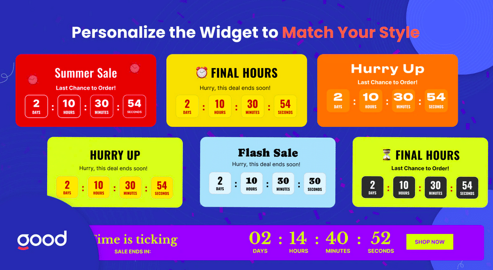
Fake urgency widgets like this one are often seen as a manipulative gimmick, and should be avoided.
Creating urgency can be an effective marketing technique, but it must be used carefully. Messages such as “limited time offer” or “only a few spots remaining” can lose their impact if they are used too frequently or without clear justification. They may even reduce trust if users perceive them as manipulative. This concept of “fake urgency” can fall under deceptive advertising practices as well. The app Hurrify, for example, created timers, “limited stock” messages, and similar fake urgency messages for Shopify stores. The app was removed for deceptive practices in 2023, though many similar applications remain.
A more sustainable approach is to focus on communicating value and setting clear expectations. When urgency is used, it should be tied to a legitimate constraint, such as a real deadline or limited availability. This ensures that messaging is credible and aligned with the overall user experience.
9. Prioritizing Design Over Usability
A visually appealing website is important, but design decisions should always support usability. In some cases, sites prioritize unique layouts or visual trends at the expense of clarity. This can make it more difficult for users to navigate the site or understand how to take the next step.
Effective design balances aesthetics with function. Familiar patterns—such as clear navigation, consistent layouts, and recognizable buttons—help users interact with your site more easily. Testing design decisions with real users or gathering feedback can provide valuable insight into how well your site supports its intended goals.
Create a Clean, Straightforward User Experience
In many cases, simply prioritizing a clean, straightforward, and honest experience for your users will also create a happy one. By focusing on reducing friction and making it easier for users to find information and take action, you can create a more effective and enjoyable user experience. Over time, these improvements can lead to better engagement, stronger trust, and more consistent results from your website.