

When your website is easy to navigate and enjoyable to look at, users will want to stay and they’ll be able to take the next step easily. That means they’ll be more likely to contact you or make a purchase. However, if visitors feel confused, uncertain, or frustrated, they’re more likely to click away. Understanding points of friction on your site and solving them can help increase conversions, traffic, clicks, dwell times, and more.
Let’s take a look at some practical ways to reduce friction and create a smoother user experience.
What is Friction on a Website?
First of all, what do we mean when we talk about ‘friction’ on a website? In this context, friction are points of confusion, annoyance, or general difficulty a user experiences on a website. This can come from many places; a button or link might not appear in the expected place, colors might be difficult to see or distinguish, text might be too small or close together to comfortably read, or many other things.
By eliminating these points of friction, we can create a smoother, more enjoyable experience that encourages customers to move through and around the website easily. This, in turn, helps them take the next step, such as making a purchase or scheduling a service, which improves the value of your website in general.
Not sure why your website isn’t delivering results?
We’ve helped hundreds of businesses and organizations transform their websites into real tools with real results.
Get in touch today to learn more >
10 Ways to Reduce Friction on Your Website
There are many ways that your website might annoy visitors, which we’ve covered in a previous post. Annoyance is generally more obvious than friction, which is more subtle. In this post, we’re covering the smaller things that can create difficulty or confusion. Think of it like this; points of annoyance actually create a bad experience for users, while friction generally just stops visitors from taking the next step.
Removing points of friction will take your site from neutral to good, and actually create an enjoyable shopping, browsing, or research experience.
1. Use Clear, Action-Oriented Buttons

This industrial manufacturer’s website uses clear buttons, an appealing color scheme, and intuitive navigation to reduce friction.
Buttons are one of the most important elements on your site. These are usually calls-to-action, and they guide users toward the next step. If your buttons are vague, hard to find, or inconsistent, users hesitate. They might not know where to go to find what they’re looking for.
Use clear, specific language like “Get a Quote,” “Schedule a Demo,” or “Download the Guide.” Make sure buttons stand out visually and appear exactly where users expect them, especially after key pieces of information. Use appealing shapes and color schemes, and remember that adequate color contrast is important for visitors with low vision or color blindness, but it also helps create a better experience for all users in general.
2. Organize Products and Services the Way Customers Think
Your internal structure might make sense to your team, but it doesn’t always match how customers search or browse.
Organize your offerings based on how users naturally categorize them. This might mean organizing them by type, use case, industry, size, or even experience level. The easier it is for users to recognize where they should click, the faster they move forward.
Instead of guessing how users prefer to navigate your products, services, or information, ask them. Asking the right questions and performing user testing is the best way to make sure you’re actually tapping into what your audience wants.
3. Make Content Easy to Browse and Navigate
If you have a blog, resource center, or library of content, organization matters just as much as it does for products. Your visitors should be able to find what they’re looking for easily and get the answers that they need. If they don’t, they’re likely to click away and find it elsewhere.
The organization of your information is especially important for your content marketing funnel, especially if your product or service requires a lot of research or consideration for your customers (bigger, more expensive purchases usually have a longer consideration stage). However, it’s helpful for any business to have information about their offerings; if you’re not answering your customers’ questions, someone else will.
Use categories, tags, filters, and search functionality to help users find what they need quickly. Group related content together and surface your most valuable resources so users don’t have to dig. Once again, ask your customers what they’re looking for, don’t guess. This way, you can be sure you’re making the right answers easy to find.
4. Simplify Your Navigation Menu
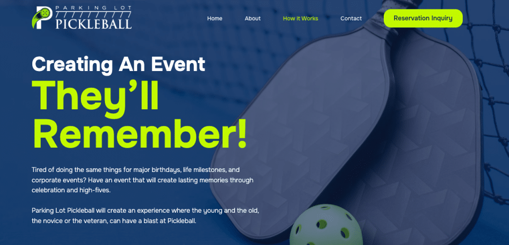
This community sports website uses a simple and straightforward navigation menu to ensure visitors get their questions answered in one click.
Complex menus create decision fatigue. If users have too many options or unclear labels they’re more likely to get lost or leave.
One of the most important website conventions to follow is easy, straightforward, top-aligned (or, in some cases, side-aligned) navigation. Users intuitively know where to find these links and how to navigate them, since this is a common practice across the web. Another rule of thumb is this; users should be able to find what they’re looking for in less than three clicks. If they have to click four layers deep, the information, product, service, or page is simply too buried.
Limit your top-level navigation to the most important pages. Use simple, intuitive labels and avoid industry jargon. If needed, use dropdowns thoughtfully, but don’t overwhelm users with too many layers.
5. Reduce the Length of Your Forms
Forms are important on your website. They help you gather information, answer a visitor’s question, and interact with your potential customers. However, a badly-organized form can create friction on your website.
The first thing to consider on your form is form fields. Every additional field in a form adds friction. If a form feels long or invasive, users are more likely to abandon it. Consider what information you actually need in the form, and only ask for that. Usually, this might simply mean asking for the customer’s name and email, so you can get in touch with them.
In some cases, you might need more information to fulfill a customer’s request, but consider; would it be easier and better to just contact them directly and ask them these questions? Adding form fields is likely to overwhelm your prospect, and they might not contact you at all.
6. Surface Reviews and Social Proof Prominently
Reviews, testimonials, and case studies are important to potential customers. They demonstrate trust, and show that you can back up the promises that you make on your website. If users have to search for reviews or testimonials, you’re creating unnecessary friction in the decision-making process.
Place reviews where they matter most—on product pages, near calls-to-action, or in a visible carousel. When trust-building content is easy to find, users feel more confident taking the next step. Ideally, use reviews, testimonials, or case studies that make sense with the page.
Remember that bad reviews can also serve a purpose. For example, if a customer gives a bad review because they felt the size of a product wasn’t accurate, this can tell you to include a sizing chart. This also gives other customers more information, and shows that your reviews are real and honest, not AI-generated, fake, or paid-for.
7. Make Contact Information Easy to Find
When users are ready to reach out, any delay can cost you the conversion. A way to contact you should be very easy on your site, especially if a call or consultation is a key part of your sales process.
Include a clear “Contact” link in your navigation and make key information—like your phone number or email—visible in your header or footer. This should be a “sticky” header that’s available on every page. You might also consider click-to-call functionality to remove extra steps.
8. Use Whitespace to Improve Readability
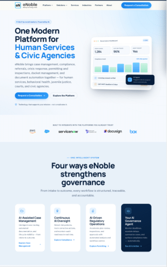
This SaaS site uses empty space (whitespace) and blocks of content carefully to make it easily scannable and immediately comprehensible.
A cluttered page overwhelms users and makes it harder to focus. Whitespace is a tool that helps guide attention. Using whitespace thoughtfully can make the difference between a page that creates fatigue and eye-strain, and a page that’s pleasant, and makes users want to stick around.
Break content into smaller sections, use headings and spacing to create structure, and give important elements room to breathe. This makes your site easier to scan and more enjoyable to use.
9. Prioritize Accessibility for All Users
Web accessibility isn’t just about compliance, it’s about usability for everyone. When users with all different levels of ability—including vision, dexterity, hearing, and more—can use your site equally, you’ve created a welcoming space for everyone.
It’s also important to remember that accessibility improvements generally increase usability and a positive user experience for everyone. For example, adequate color contrast is essential for people with color blindness, but it also is a more enjoyable color palette for everyone.
Ensure your site is readable, navigable by keyboard, and usable with screen readers. Use sufficient color contrast, clear fonts, and descriptive labels. When your site is easier to use for more people, you reduce friction across the board.
10. Make Your Website Fully Responsive
For many years, the only way to access a website was through a computer. But smartphones changed the game. Circa 2018, more web traffic actually came from mobile devices than laptops or desktop computers. Now, between 60 to 70% of traffic comes from mobile devices, depending on region, industry, type of business, and more.
All this means that responsive websites—websites that automatically re-organize themselves for mobile devices—are critical. If your site doesn’t work well on smaller screens, you’re introducing major friction. Users on mobile devices will click away immediately if your site isn’t navigable.
Use responsive design so your layout adapts seamlessly to any device. Test your site on phones and tablets to ensure buttons, menus, and forms are easy to use without zooming or frustration.
A Smoother User Experience
Reducing friction means removing small obstacles at every step of the user journey. This usually doesn’t involve any big changes, but rather a series of smaller changes. Sometimes, this can simply mean changing the size or color of a button on a page. In other cases, it might mean editing your template or re-organizing your blog or shop. Some of these changes you can make yourself, while other changes might be more challenging.
If your web traffic, conversion rates, dwell times, or other metrics aren’t where you want them to be and you know areas of friction on your website are to blame, we can help. We’ve helped hundreds of businesses, municipalities, professional organizations, and more make changes to their websites that produced real results. Get in touch with us today to learn more about reducing friction on your website and creating a better online experience for your customers and staff.