Re-branding can be an intimidating process for major businesses that have an established consumer base, especially when those changes involve updates to a company’s logo. Despite the risk of distancing loyal customers, many major companies have undergone successful re-branding throughout the last few decades. However, some logo evolutions include designs that never should have happened. The Arby’s logo is a prime example of what not to do and how to come back from a logo design disaster.
Meet Arby’s
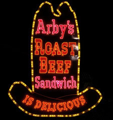
The year was 1964, and America was hungry for more than just a burger. Arby’s answered that call by providing their now famous roast beef sandwiches, first in Ohio and then throughout the country. Perhaps spurred by the popularity of westerns at the time, the original Arby’s logo was a giant cowboy hat outlining big, blocky slab-serif letters that proclaimed, “Arby’s Roast Beef Sandwich is Delicious.”

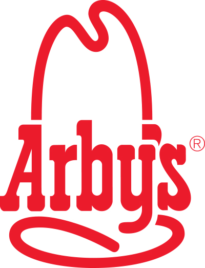
The logo had charisma and charm, but in 1975, as more restaurants were popping up, it was time for a change. The logo still held the classic cowboy hat outline, but the text was shortened to “Arby’s.”
This designed reigned from 1975 to 2012 and is still how many people associate with the brand. The familiar ten-gallon hat served as a beacon to weary highway travelers looking for a place to grab some curly fries and a roast beef sandwich before hitting the road again. The hand-drawn lettering gave the logo a personal touch and made the brand as a whole feel “comfortable”. So why did Arby’s try to change it and what went wrong?
2012
Time goes on and styles change. Updating a company’s logo is inevitable. Arby’s recognized this and with the release of their new marketing campaign, “Slicing Up Freshness,” came a dramatically different logo.
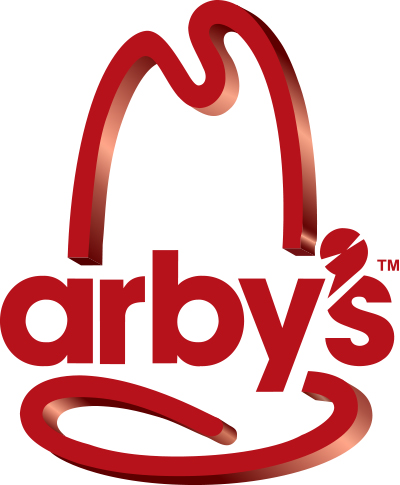
The new logo still had the iconic cowboy hat but with a glossy 3D effect. The new text ditched the hand drawn letters in favor for a geometric sans-serif. The letters are flat with no 3D effect and consequently conflict with the shiny hat. The logo lacked the personality of the slab-serif text that consumers had become so familiar with.
Overall, the design severely lacks cohesion. The modern type is in direct opposition to the old-timey, western hat. In a last ditch effort for creativity, the logo designer attempted to make the apostrophe into a meat slicer to align with their “Slicing Up Freshness” campaign but falls short of making it even a little appetizing. The whole logo with the glossy hat and boring type makes the design feel as cold as the metallic meat slicers in the restaurants. Consumers agreed and did not like it.
Then What?
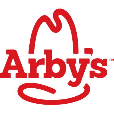
Fortunately, this is a comeback story. Arby’s listened to their consumers and in 2013 went back to a style more suited for their restaurant. The most recently updated logo features a 2D shortened cowboy hat and those blocky, slab serif letters. They aren’t the same hand drawn, wonky-styled letters they were in the past, but they emulate the brand’s history and the western appeal the original restaurants had.
So What Can We Learn?
When Arby’s tried to overhaul their brand to be clean and modern it fell short of people’s expectations. After all, Arby’s is a restaurant that serves hearty roast beef sandwiches, savory fries and other delicious foods. The fast food joint, as a whole, has a lot of it’s own style and personality. So what can we take from Arby’s logo history?
-
Stay true to your roots
Arby’s had to backtrack to their original hometown, country-western style to win back respect for their logo. It’s how their brand was established and how people recognize them now.
-
Baby Steps
Arby’s had the same logo for almost 40 years, and instead of gradually moving to a modern style, they drastically switched to a completely different one. Generally, people are not initially accepting of change, and a dramatic switch up can make consumers uneasy.
-
Keep it Simple
Simple designs are almost always favored over complex ones. Arby’s overcomplicated their logo by adding 3D effects and gradients. The new design does such a good job of balancing line thickness and white space that it doesn’t need anything else.
-
Cohesion is Key
What the 2013 Arby’s logo lacked the most was consistency. The perspectives didn’t match all. The hat outline had a 3D effect that made you feel like you were looking at it at an angle, while the text had no effect and felt like you were looking at it dead on. This heavy text didn’t match the line weights of the hat.
Conclusion
Many companies undergo major brand overhauls that aren’t readily accepted by their consumer. Luckily, Arby’s was able to listen to their customers and fix what went wrong. If you’re looking to redesign your logo, keep these elements in mind so you don’t make the same mistake.
Know another company that went through a major re-brand? Tell us about it below!


