CSS allows you to customize web pages and change various element properties. One of the more powerful things you can do with CSS is animation. CSS animation can bring your website to life and enhance your users’ experience. If you’ve ever worked with CSS3 you might see properties like transform or transition in a stylesheet. CSS3 includes many new ways to dynamically transform your content quickly and easily. CSS animations are a great way to add additional polish and refinement to your site without disrupting the normal document flow. Today we’re going to be building a basic card flip using CSS animation. Throughout the building process we’ll be reviewing key properties which make it possible for these animations to run.
Let’s look at a beginner’s guide to CSS3 transformations in a 3D space. It is a relatively quick and easy process, and we have outlined this CSS 3D card flip animation tutorial, using CSS3, to help guide you through the process.
Part 1 – The Basics – HTML Structure
To start off, we’ll begin by building out our container in HTML.
<!DOCTYPE html>
<html>
<head>
  <meta charset="UTF-8">
  <title>Card Flipper</title>
</head>

<body>
  <div class="container">

  </div>
</body>

</html>
Next, we will create two card faces. In this example I have one face which is our company logo and another face which includes a brief summary.
<div class="container">
  <div class="card">
    <div class="face front">
      <img width="300px" src="logo.svg">
    </div>
    <div class="face back">
      <p>Web Ascender is an innovation services company that truly cares about your
happiness and the success of your project. We are leaders in web development, mobile
 applications and internet marketing, but our team doesn't just make beautiful digital
 products. We successfully solve real problems for people and businesses.</p>
    </div>
  </div>
</div>
If you’re wondering what that .svg file is it’s a Scalable Vector Graphic – Check out my blog, SVG 101: The Power of SVG, for more information on SVG files.
Part 2 – Implementing Your Flip Card With CSS
Now that we have our structures in place, let’s tackle the styling. Let’s first define our container – This will house the 3D space for our card flip.
.container{
  width:400px;
  height:280px;
  position: relative;
}
Now let’s beautify our logo and text content.
.card{
  text-align:center;
  position: absolute;
  width: 100%;
  height: 100%;
}

.face {
  position: absolute;
  width: 100%;
  height: 100%;
}
.face.front{
  background:#000;
}
.face.back {
  display: block;
  box-sizing: border-box;
  padding: 20px;
  color: white;
  text-align: left;
  background-color: #333;
}
Part 3 – Animating Your Flip Card With CSS3
.container{
  perspective: 800px;
}
.card{
  transform-style: preserve-3d;
  transition: all 1.0s linear;
}
.card:hover .front{
  transform: rotateY(-180deg);
}

.card:hover .back {
 transform: rotateY(0deg);
}
.face {
  backface-visibility: hidden;
  transform-style: preserve-3d;
  transition: 0.5s;
}
.face.front {
  transform: rotateY(0deg);
}

.face.back {
  transform: rotateY(180deg);
}
perspective: 800px; The perspective property defines where the 3D element is placed in the view.
transform-style: preserve-3d; This prevents the faces of the card from being flattened. For a better example of this, checkout this webkit demo –https://www.webkit.org/blog-files/3d-transforms/transform-style.html
transition: all 1.0s linear; This is a combined property made up of the transition-property, transition-duration, transition-timing-function, and transition-delay. In this case we are transforming all properties for 1 second at a constant speed.
transform: rotateY(180deg); This is probably the most import property. This allows us to rotate the element over the Y-axis.
backface-visibility: hidden; This prevents any content on one side from appearing on the other (rotated) side. This allows us to create our 2 distinct faces.
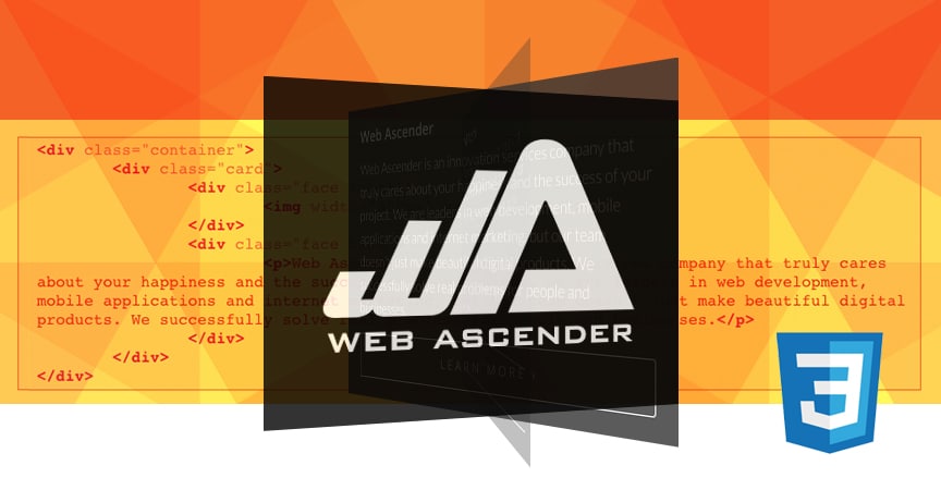
Part 4 – The Finished Product!
Web Ascender
Web Ascender is an innovation services company that truly cares about your happiness and the success of your project. We are leaders in web development, mobile applications and internet marketing, but our team doesn’t just make beautiful digital products. We successfully solve real problems for people and businesses.
Now that you have completed this CSS animation tutorial on creating a 3D card flip using CSS3, you can go on to create more animations of your own. We hope that this animation example helped you learn more about using CSS3 and the CSS transforms function, and we encourage you to use it when creating your own web design template. In addition to providing the CSS3 code used in the tutorial, here is another example of a 3D card flip featured on a website designed by the Web Ascender crew..