It’s not a secret that photographs provide a nice visual experience for people, and text helps convey the message you are trying to communicate. That is why the pattern of placing text on top of large photographs has been a prominent technique in web design for the last few years. However, it’s not as simple as it sounds. There are a lot of elements that you need to consider when choosing the right photograph for your message. You cannot simply place text over any photo and expect it to work.
When I’m designing for my clients, there are 4 questions that I always consider before I move on.
- Is there too much going on? (Complexity of Photo)
- Is the font large enough to stand out? (Font Size)
- Is the font light enough to be placed on a dark photo, or dark enough for a light photo? (Text to Background Contrast)
- Can I ultimately read the message I am trying to convey? (Overall Readability)
If you can’t say yes to all these questions, then it’s time to consider a different photo or a different text overlay. If you’re looking for some inspiration, I’ve put together a nice list of tips and tricks to help you properly mix text with imagery and to help ensure success with your next web design project.
1. Color Overlay – Color overlay, also known as color cast, is a technique in which you place a touch of color over an image. In the past, adding a black or white filter was the most common practice, but recently we have seen a rise in vibrate color overlays. This technique allows for the photo to become less prominent and forces the text to pop out at the reader.
2. Gradient Overlay – Gradient overlays are very similar to color overlays, but this technique uses gradients typically from one side of the color spectrum to another. Not only does the gradient overlay give the photo a refreshing look, but it can also set the mood based on the chosen colors. Depending on the level of transparency, this type of filter will make the photo less prominent, allowing the text to be clearly legible.
3. Image Blur – Image blurs are one of the easiest techniques for making text readable. But image blurs are not perfect for every situation. The trick is to find the right photo and the right level of blur so that your eye does not become confused or strained. This technique is best used on projects where you want to create a background texture, rather than showcase the client’s work.
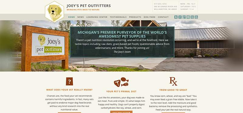
4. Shape Overlay: Using a solid or transparent shape is a great way to improve readability of text on top of a photo without loosing important elements of the photo itself. This technique is best for projects where you need to showcase the clients work and really make an impact with a specific image.
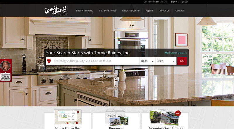
5. Text With Background Color – Text with background colors are very similar to the background shape technique. But text with background colors allow you to see even more of the image. Only the area directly behind the text is filled with a solid or transparent color, allowing the users to clearly read the content without loosing much or any of the photo.
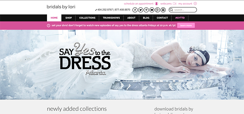
6. Placement – Placement of text is always important, and sometimes choosing the right photo makes it very easy to determine the correct location for the content. Placing text on less complex areas of a photo will typically improve the readability.
7. Text Drop Shadow – Adding a drop shadow to your text will help increase readability in photos with more complexity. This technique is great for projects where you want to showcase your clients work without adding any type of photo filter.
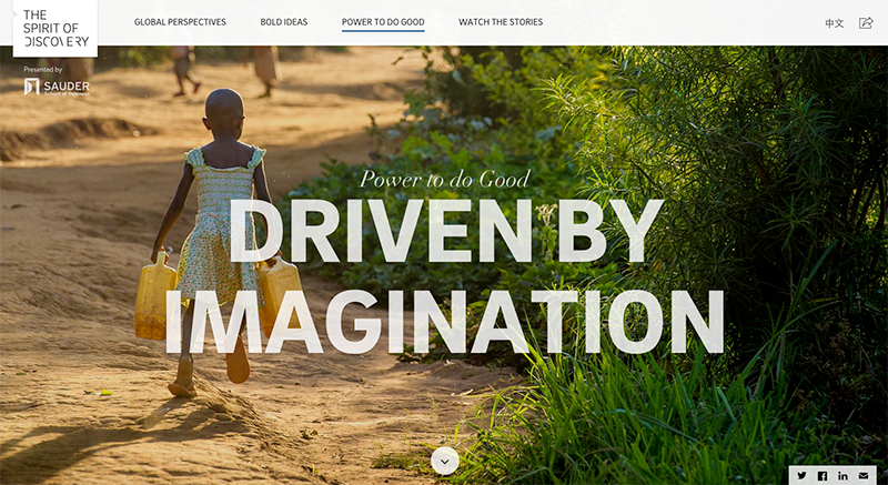
8. Large Text – Large text might just be the easiest way to improve readability. But you will still need to be aware of text -to-background font contrast. Make sure you choose a dark photo with light text or a light photo with dark text.
From one web designer to another, I hope these techniques help inspire your next web design project.
Know of any other trendy photo & text overlay techniques? I’d love to hear about them. Please post the details below!


