
Forms are an important part of your lead-generating strategy. When building forms in digital marketing, it can also be difficult to strike the right balance between information-gathering and simplicity. Let’s take a look at some form templates and tips to build a better form to increase submission rates.
7 Ways to Build Better Forms and Raise Conversion Rates
1. Assess Your Information
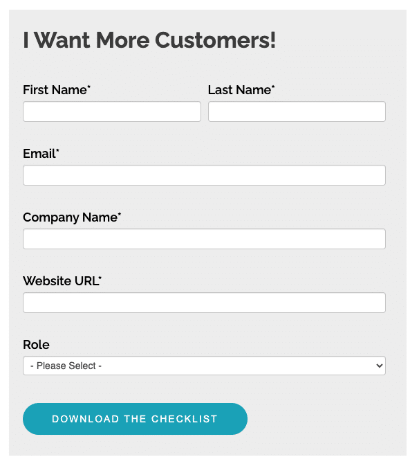
One of the best ways to build a better form and raise conversion rates is to simplify the form. Estimates suggest that conversion rates for forms with more than 6 fields drop by about 10% compared to forms with only 3 fields. When your form provides less friction and it’s easier to fill out, potential leads and customers will be more likely to do so. However, if your form doesn’t provide the information you need, it can create other problems. So, assessing the form’s purpose and deciding how much information you actually need can be a great way to build a better form.
A few clarifying questions can help you gather important information, while still making an easy and simple form.
The Form’s Purpose: Contact vs Qualify
If the purpose of your form is to simply get in contact with the maximum number of interested people, you really only need their email address. Getting their first name is also useful to personalize messages a bit. This is great for staying in contact with newsletters, email drips, and other promotions that might move them from lead to qualified lead or customer.
If you’re looking for a more specific audience, then you’ll need more form fields. The previously mentioned form that only requires a name and an email address might provide more leads than a salesperson can follow up with. It also doesn’t provide any ways for the marketing department to further qualify leads or determine which salesperson might be best to make the next contact. These types of forms should still reach a wide audience, but they should also provide important information the marketing or sales teams need to make decisions.
Here’s some examples of essential information every form should include, qualifying information you might use to determine which leads to contact further, and directing information the sales department might need to determine which salesperson should handle the lead. Some of these types of information can be used to direct as well as qualify, so you only need to include it once in the form.
- Essential: name and contact information (usually email)
- Qualifying: reason for contacting, price range, job title, company size,
- Directing: state or region, product or service of interest
2. Use Two Columns
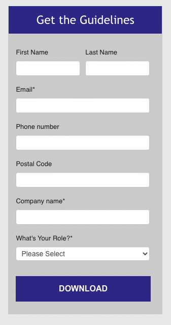
Using two columns for first and last name can make the form more appealing to users.
The formatting of your form can make a big difference when it comes to increasing submissions. Users will be more likely to fill out a shorter form, or one that they perceive is shorter. Putting form fields, especially short fields like first name and last name, side-by-side instead of one after the other can make your form easier to read and fill out.
Some longer form fields, like email address and phone number, are probably better left to their own line. However, a number of other fields can be placed side-by-side in two columns to make the form appear shorter. For example, job title and company name or state and zip code, among others, might be placed in two columns.
3. Try Sliding Forms
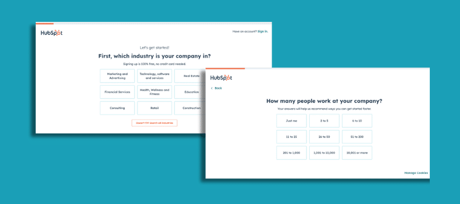
Hubspot’s longer forms slide across multiple pages, with a progress bar at the top.
Many forms show all fields at one time, however there are other types of forms that may be more effective. For longer forms, showing all the fields at once can be overwhelming to the user, and it can cause them to click away. Instead, longer forms can be spread out over several sliding pages that the user can click through.
For these types of forms, it’s a good idea to show a progress bar or another indicator that shows the user how many more pages they have to get through. This way, they won’t be immediately overwhelmed by a long form, and they’ll be less likely to get fatigued halfway through the form.
Sliding forms also offer you a way to change form fields based on a user’s responses. For example, when asking about the user’s position in their company, the follow-up questions might be different for a CEO or owner compared to a marketing manager.
4. A/B Test
A/B testing is one of the most powerful ways to improve your forms, and your landing pages, over time. Test different forms and different formats to see which ones work best. Consider removing extraneous form fields in one test, and keeping them in another. You might also experiment with sliding forms in one version of the page, and a full form in another. Or, you might change simple elements like the layout of the page, colorscheme, or even how a question is worded. Sometimes, these simple changes can yield interesting results.
5. Make Your Form Accessible
Accessibility and easy use are essential to build a better form and raise conversion rates. If your form is difficult for people to click through and fill out, conversion rates are bound to plummet.
It’s important to remember that people use the internet in different ways. For example, many people use a desktop computer or laptop, while many others use their smartphones or tablets. Many other people use assistive technology such as screen readers, screen magnifiers, alternative input devices, and more. Some issues that affect people who use assistive technology also affect other users. This means, making your forms accessible to those with low vision or dexterity can also improve the overall experience for all users.
Here are a few things to keep in mind to make your forms accessible and easy to use:
- Form labels: Labeling your forms, not only visually but also within the form’s code, helps all users navigate the form properly, including blind or low vision users.
- Color contrast: Adequate color contrast between all elements, including placeholder text or instructions, is important to make the form accessible as well as appealing. Free color contrast checker tools can help you choose the right colors and shades.
- Screen size: Your form should reorganize itself properly across different screen sizes, including laptops and smartphones. If users have to move their screen to see your form fields and fill them out, it’s not reorganizing properly.
- Test: You can test for accessibility yourself by making just a few adjustments. Test your form using different devices as well to make sure it’s usable for many different users.
6. Weed Out Bots
Strategies to build better forms and raise conversion rates is mostly about improving the user’s experience, however it’s also about getting better information for your own team. If your form doesn’t protect against bots, you’re probably getting a lot of fake submissions. This can make it harder to parse through the information to see real leads, and it wastes time overall.
A variety of strategies can help you weed out different bots and stop them from spamming your forms with artificial responses. Try this list of ideas. If you’re not familiar with these strategies, talk with team’s web experts or your particularly tech-savvy friends.
- CAPTCHA: These simple tests use a bit of text or a button to tell human users and bots apart.
- Honeypot fields: These fields are invisible to users, but clear to bots. When bots fill them out, the form won’t be submitted.
- Firewalls: Web application firewalls built into your website help to prevent bots from accessing your site.
- Time restrictions: Bots fill out forms in an instant, while a person will need at least a few seconds. Setting a minimum time limit can help prevent bots from making submissions.
This list of tools certainly isn’t exhaustive, and other solutions to weed out bots also exist. If you’re having trouble with false submissions, look into some increased security for your pages or your forms.
7. Leverage the Right Tools
Increasing form conversion rates doesn’t help much unless you have the right tools to use the leads you collect. Integrating your forms with a CRM system or other tools to manage submissions can help you get more value from them.
There are many different systems to choose from, and finding the right fit can be difficult. Consider what you need your CRM system or another organizational tool to do, from tracking leads through different stages, integrating different departments, utilizing marketing tools, and more. Getting the right tools can help you streamline your tasks as well as your tech stack.
Building better forms can help you get more leads and more customers. If your landing pages or forms aren’t performing as well as you’d like, consider these tips to raise conversion rates.