
Choosing an effective color scheme for your business website can be a difficult decision. However, by learning the basics of color theory and experimenting with color tools available on the web, you’ll be able to choose harmonious color schemes and palettes on your own! We’ve updated this post in 2025 to include additional information on color theory and how it relates to your branding, as well as tools to help pick the perfect colors for your website or another online project.
As you go through this post, our brand style guide template might help you to build up or reinforce your brand colors and style. Simply click the link and make a copy of the document to start building your own brand style guide.
In this post:
- What is Color Theory?
- What Are Color Schemes?
- Warm vs Cool Colors
- Tints and Shades
- Saturated vs Unsaturated Colors
- Online Color Scheme Generators
- How to Choose Colors for Your Website
- The Psychology of Color and Mood
- 4 Questions to Help You Choose Colors for Your Website
What is Color Theory?
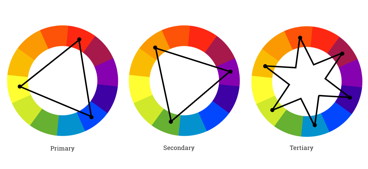
Color theory is based on the principal guidance of color mixing and the visual effect of a specific color combination by use of a color wheel. The traditional color wheel, called the color circle, was based on red, yellow and blue. But over the years, the color circle has evolved into the color wheel, which presents a larger range of colors and, more importantly, the relationship between primary, secondary and tertiary colors.
- Primary colors are made up of 3 pigments: red, yellow and blue. They can not be mixed or formed by any combination of any color. But all other colors come from mixing these colors.
- Secondary colors are green, orange and purple. These are formed by mixing the primary colors.
- Tertiary colors are yellow-orange, red-orange, red-purple, blue-purple, blue green and yellow-green. They are formed by mixing a primary color and a secondary color.
What Are Color Schemes?
By using a color wheel we are also able to determine harmonious color combinations with any 2, 3 or 4 colors. These harmonious color combinations are called color schemes and are comprised of Monochromatic, Analogous, Complementary, Split Complementary, Triadic and Tetradic.
- Monochromatic color schemes are comprised of tints, tones and shades of a single hue.
- Analogous color schemes are a group of 3 colors that are adjacent to each other on the color wheel.
- Complementary color schemes are made from 2 colors that are opposite each other on the color wheel.
- Split-Complementary color schemes are a variation of the complementary color scheme that uses 2 colors adjacent to it’s complement.
- Triadic color schemes use colors that are evenly spaced around the color wheel.
- Tetradic color schemes use 4 colors arranged into 2 complementary pairs.
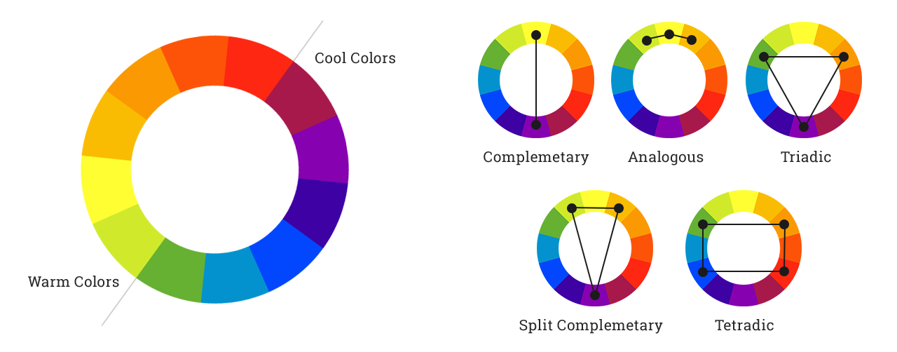
Warm Vs Cool Colors
To understand color theory better, you’ll also need to understand warm and cool colors. Warm colors are the yellows and reds of the color spectrum that transmit happiness and energy. Cool colors are the blues and greens of the color spectrum that convey calmness and peace. The color wheel itself can be easily split to determine where warm and cool colors start and end.
Whether a color is warm or cool is based on its hue, which is a particular point on the color wheel. Red, yellow, green, blue etc. are all unique hues. Each hue has variations of different shades, tones, and tints. For example, cornflower blue is a lighter version of blue (a tint), navy blue is a darker version (a shade), and steel blue is a less saturated version (a tone). These colors are all different, but they’re all the same hue.
Tints and Shades
A hue’s lightness or darkness refers to its value. Value is another important consideration when choosing colors for your website. The most classic value combination is black text on a white background. Of course, there are many other value combinations that can make your website colors attractive and functional.
Adequate Color Contrast
When considering tints and shades for your website color scheme, it’s important to achieve a suitable level of contrast. Adequate contrast makes your site more enjoyable and easier to navigate. This is particularly important for text and backgrounds. Keep in mind that millions of colorblind web users see a more limited range of hues, so a lack of value or saturation contrast will make certain hues blend together. WebAIM’s Color Contrast Checker makes it easy to choose colors for your website that everyone will find functional.
Saturated Vs Unsaturated Colors
A hue’s saturation, also known as its intensity or chroma, are also important. When mixing a hue with its complement or with grey, it will become less vibrant. Many colors with low saturation are considered neutral colors. This might include a darker, less saturated beige or grey, as well as pastel colors with low saturation, such as blue-grey or a faded pink.
Generally, less saturated colors tend to stand out less, and they tend to be more gentle to the eyes. Colors with more saturation will draw the eye and using too many bright colors can be overwhelming. Using saturation thoughtfully can help choose the right colors for your website.
Now that you have a basic understanding of color theory you can start experimenting with color tools that are available online! I’ve gathered together a list of some awesome tools to help you perfect your color scheme choices.
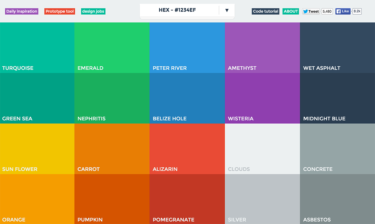
Online Color Scheme Generators
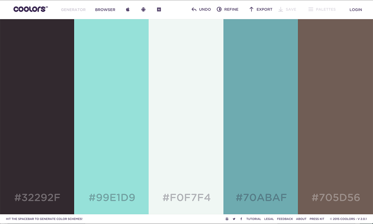
Coolors
Coolors is a super easy and fast color scheme generator. The generator loads 5 harmonious colors to create a new color scheme. If you don’t like what it comes up with, then just hit the space bar and fly through endless color possibilities. If you’re totally rebranding or choosing colors for a brand new website or business, this is a great place to start.
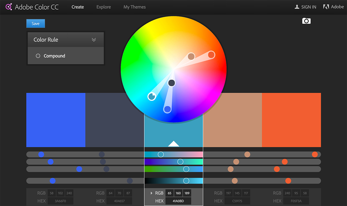
Adobe Kuler
Adobe Kuler has a few nice features. You can choose to browse through already created color schemes by sorting through themes or searching key words. You can also generate your own color scheme by using the color wheel. This is great if you have a color in mind and your looking for complementary colors or other color rules. You might start here if you have a logo color in mind, but you’re not sure what to pair it with.
Flat UI Colors
With Flat UI being one of the most popular trends, this website will ensure that you’re selecting the most popular Flat UI colors. Flat design is a minimalist design style that highlights simplicity and efficiency. You’ll have to be a bit more careful about what colors you pair together using this tool. Refer back to the color schemes mentioned above for some guidance if you’re feeling unsure.
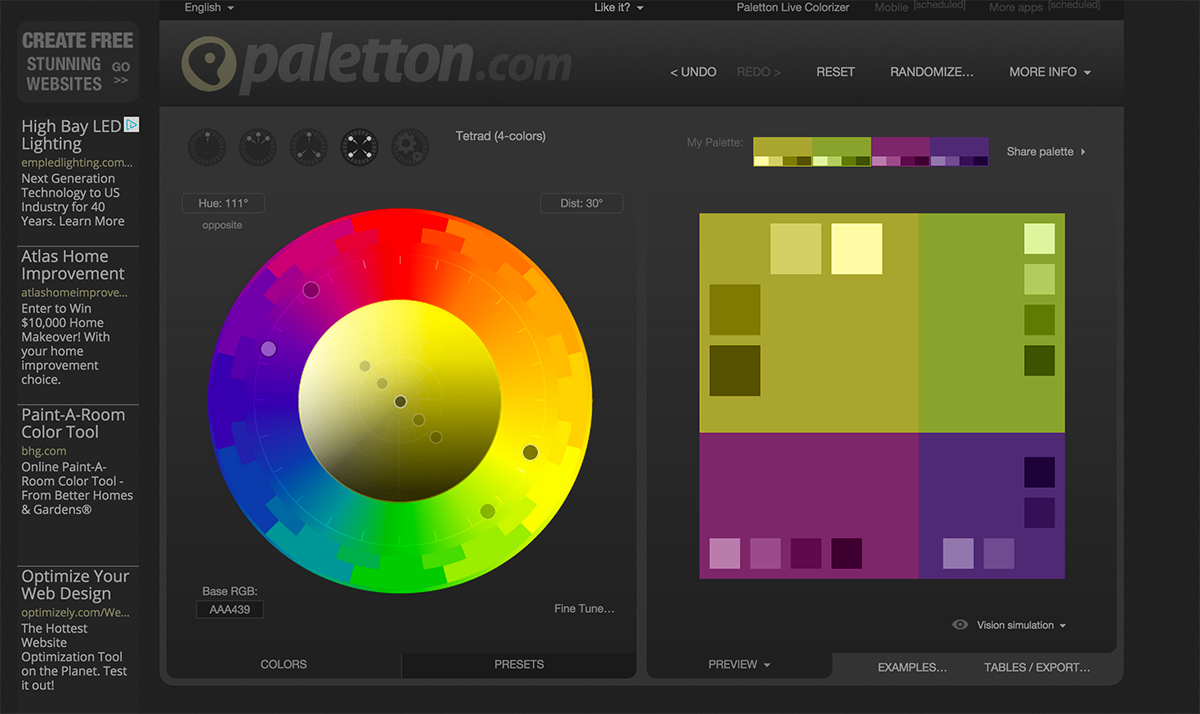
Color Scheme Designer 3
Color Scheme Designer 3 is a great designer tool for creating color combinations that work well together. This tool works great for random color generation, but it’s even better for when you have that specific color in mind. This tool will help you come up with a harmonious color scheme to go along with any color! This tool is also helpful if you have a logo color in mind, but you don’t yet have a full color scheme for your website.
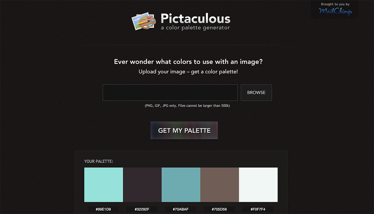
Pictaculous
Pictaculous is a color generator that lets you extract a palette of colors from any image. This tool works great when you have a picture in mind, but don’t know what colors you should pair with it. You might choose a particular scene that inspires you, a photo that you yourself took, or a photo of your office or store to get a matching color scheme. Or, you can take a screenshot of another website you like, and see what color they are using. Remember that getting inspiration from another website is only a starting point; you’ll need to change some colors to get your own style.
How to Choose Colors for Your Website
With a basic understanding of color theory, color schemes and a list of color picker tools, you’re ready to pick your website colors. A few more tips can help you choose website colors that accurately represent your brand and connect with your audience.
Color and Brand
Color, along with fonts, imagery, style and other elements, all make up your brand. Your colors, just like all these other elements, can add to your brand if it’s consistent, or detract from it if it’s not. As you choose colors for your website, you might start with the color(s) you use in your logo, a particular picture or competitor’s logo you like, or a mood you want to create. To do this, it’s helpful to understand the associations we have with colors.
The Psychology of Color and Mood
If you already have a logo, or have one in mind, you already have at least one of your colors selected. A little over half of major brands use only one color in their logo. More than two thirds of major brand logos use either blue or black. Starting with your logo color, choose three to five additional colors using the tools previously mentioned. This will give you a cohesive color scheme.
Color and Mood
Though the psychology of color and mood are complex—and there are more dramatic differences in the meanings of colors across different cultures—there are some popularly understood trends and associations with colors. The colors you choose for your website should match the mood you wish to convey.
Blue
Blue is most commonly associated with security, safety, stability, trust, and expertise. This is also the most popular hue used in logos, and its use is vast. Consider the logos from businesses like AT&T, IBM, HP, Blue Cross Blue Shield, Chase Bank, GM, Facebook, Twitter, Cisco, GE, Walmart, Lowes, and many more. Other associations with blue might include police uniforms, rain, the ocean and the sky.
Red
Red also has many diverse associations. This eye-catching hue is associated with passion, desire, strength, violence, and excitement. A diverse range of brands use red, from YouTube to CNN, Netflix, Heinz, Kraft, Target, Marvel, Coca Cola, CVS and many more. Red and yellow are thought to stimulate the appetite by inspiring joint feelings of desire and satisfaction, so it’s commonly used in food brands. Other associations with red include roses, blood, fire, firetrucks, berries, stop signs and hearts.
Yellow and Gold
Yellow is usually associated with cheer, optimism, warmth and satisfaction. As previously mentioned, you’ll commonly see yellow and red used together in food brands. Yellow and gold are also very similar, and gold can be associated with wealth and prestige. Some brands using yellow include Nikon, National Geographic, Best Buy, UPS, and Chevrolet. Other common yellow associations are the sun, sunflowers, stars, and caution signs.
Orange
The use of orange is very similar to yellow and red. It tends to be associated with excitement, optimism, and creativity. Some of the most recognizable orange logos include those for Amazon, Mozilla, Fanta, Nickelodeon and Harley Davidson. These brands are quite diverse, so the use of orange is understandably diverse as well. Other orange associations include flowers, butterflies, traffic cones, tigers, autumn, carrots and oranges.
Green
Green is commonly associated with environmental consciousness, health, wealth and growth. Many brands that seek to portray a strong environmental stance, or rebrand after an environmental problem, will utilize green. This practice has even earned the name “greenwashing.” Compare the use or purpose of green in logos like BP, Starbucks, and Cargill with others like the Sierra Club, Animal Planet, the Rainforest Alliance and others like XBOX, Fidelity Bank, or Android products. Some of the most common green associations include money, grass and plants, the recycling symbol, mint and lime.
Purple
Purple tends to be associated with creativity, fun, imagination and indulgence. It isn’t a common logo color, yet it is used in a diverse range of brands, from Wonka and Cadbury candy to Twitch video streaming service, to Curves fitness, Purple Cow ice cream, FedEx shipping services, and more. Other associations with purple include grapes and wine, lilacs and violets, and royal purple fabric.
Black and White
Black and white are becoming increasingly popular logo colors. Some brands that previously used a strong color have opted for a simple black logo instead. This may be because black and white logos can be adapted to many situations. Or, they focus on a particular shape instead of a color scheme. Black and white tend to inspire feelings of balance, trust, calm, and reliability. Consider the New York Times, Apple, Nike, and Wikipedia. Black and white have many associations, including newsprint, playing cards, the yin and yang symbol, piano keyboards, music notes, penguins, pandas, zebras, light and shadows, and more.
4 Questions to Help You Choose Colors for Your Website
If you’re feeling overwhelmed by all these colors, meanings, and color theory, you might not know where to start. These questions can help point you in the right direction.
1. Are You Choosing New Colors or Reworking Old Colors?
First, do you currently have brand colors and you’re looking for a refresh, or are you creating a completely new brand? If you’re refreshing your current brand colors, you’ll probably want to make slight changes, so your brand is still recognizable. To modernize your brand, this might mean simplifying your colors. It might also mean making your colors brighter and more saturated.
If you’re looking for completely new colors, it’s helpful to start with one color that you feel best represents your brand, and then choose two or three complementary colors.
2. What Is Your Brand’s Primary Attribute?
What do you want to convey most about your brand? Are you trying to convey authority, trust, energy, fun, wealth, indulgence, reliability? Consider what customers are looking for from your brand.
For example, if you’re choosing colors for a bank, you might choose blue or green, which represent stability and wealth, respectively, for your main colors. If you were choosing colors for a theme park, you might start with purple, yellow, or red to inspire imagination, cheer, and excitement, respectively.
3. Are You New and Eye-Catching or Old and Reassuring?
Consider the effect that you want your brand colors to have on your customers. Bright colors with a high saturation will be more likely to grab your customers’ attention, while less saturated, more dull colors will be more calming and reassuring. While it’s helpful and appealing to use a combination of high-saturation and low-saturation colors, determining other aspects of your brand can help you decide which colors you want to use more often.

Consider the differences between a large, long-standing financial services company like Charles Schwab and a newer banking service like Chime. Charles Schwab uses muted colors to reinforce their brand position as a reliable authority in the industry. Chime uses bright, saturated colors to reinforce their brand position as a new, innovative, eye-catching company.
4. What Types of Products or Services Are You Featuring?
To select the right colors for your website, it’s also important to consider your products and services. If you’re featuring a lot of different products—all with their own branding and colors—choosing a lot of saturated colors will make your site complicated and hard-to-follow. However, if you’re only featuring your own products and services on your site, you’ll have more freedom to choose more energetic or dynamic colors.
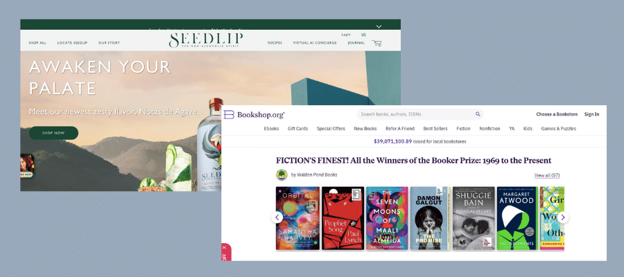
Consider the differences between bookshop.org, which features all different types of books on their website, and Seedlip, which features only their own non-alcoholic spirits. Bookshop.org limits their colors to black, white, and very light grays and pinks, so they don’t compete with the many book covers on the website. Seedlip uses a collection of darker, more saturated colors to inspire feelings of warmth and comfort.
Now that you know what these basic colors mean, how they fit together, and tools you can use to find cohesive color schemes, you can pick the best colors for your website. Take time and consider your colors carefully. This way, you’ll feel confident about your brand as you move forward.