Using photos on a website is a great way to create credibility and connect users emotionally to your brand. You can now take it a step further and ensure the photos on your site have a similar look and feel without the need for Photoshop or Instagram filters. CSS image filters allow you to change the look and feel of your photos by simply making changes within your CSS file.
How important is it that your website photos are aesthetically similar? Any Instagram expert will tell you one of the best ways to gain followers is by establishing a ‘look’ to your posts. Accounts with consistent color themes attract and engage more users than those without. Even if Instagram isn’t a part of your brand strategy, you can still implement this idea on your website by using CSS image filters on your photos.
Here’s How to Set CSS Image Filters on Your Website Photos
First, we’ve set up a page with a grid of photos using the following html:
<div class="content">

<img alt="" src="photo-1.jpg" />

<img alt="" src="photo-2.jpg" />

<img alt="" src="photo-3.jpg" />

<img alt="" src="photo-4.jpg" />

<img alt="" src="photo-5.jpg" />

<img alt="" src="photo-6.jpg" />

</div>
We’ll then set up our images to have a little space between them using margins:
.content img {

margin: 3px;

}
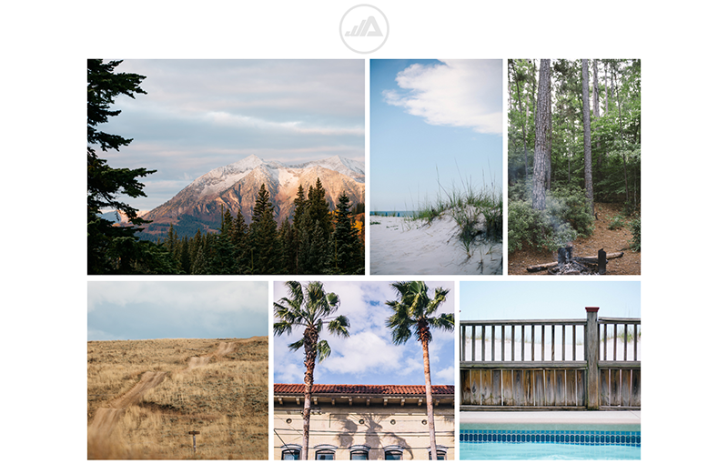
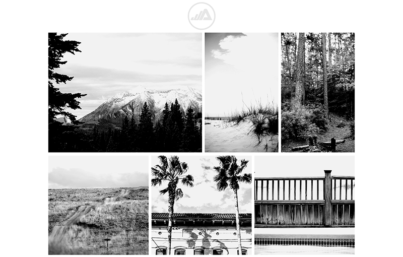
These photos are great as-is. They follow a consistent theme and have similar lighting but let’s say we want to change the look of the images. We can use the CSS image filters property to change all the images in my grid to look completely different. In this case, I want to see how all of my images look as gray scale images using the following code:
.content img {

filter: grayscale(100%);

margin: 3px;

}
I use the function ‘grayscale’ set at 100% to completely desaturate my images.

I can take it a step further and add multiple filters to my photo. In this case I’ll bump up the contrast to make the shadows stand out and decrease the brightness to make my whites a slightly darker shade.
.content img {

filter: grayscale(100%) contrast(170%) brightness(95%);

margin: 3px;

}
If I wanted to add a little more color to my photos, I can decrease the value of my gray scale to 60%.
.content img {

filter: grayscale(60%) contrast(170%) brightness(95%);

margin: 3px;

}

I can even use CSS image filters to add a color filter to my images, further enhancing my look and feel. To do this, I need to add a parent element to my images in my html file.
<div class="content">

<div class="photo"><img src="photo-1.jpg" /></div>

<div class="photo"><img src="photo-2.jpg" /></div>

<div class="photo"><img src="photo-3.jpg" /></div>

<div class="photo"><img src="photo-4.jpg" /></div>

<div class="photo"><img src="photo-5.jpg" /></div>

<div class="photo"><img src="photo-6.jpg" /></div>

</div>
Next, I apply my CSS image filters to the parent element and set them to display ‘inline-block’ and change the position to ‘relative’.
.content .photo {

display: inline-block;

filter: grayscale(60%) contrast(170%) brightness(95%);

margin: 3px;

position:relative;
I’ll use the pseudo element ‘before’ to add the filter color to my image:
.content .photo::before {

background: rgba(224, 138, 157, 0.23);

content: "";

height: 100%;

left: 0;

position: absolute;

top: 0;

width: 100%;

}
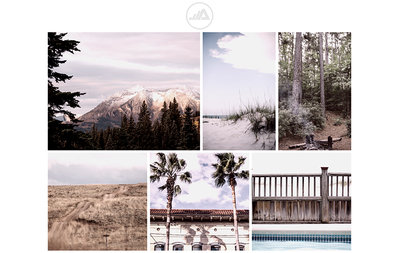
Now all of my images are slightly desaturated, have high contrast, and a warm, rosy hue overlaying them.
The Take Away
Creating your own look and feel for the images on your website is as easy as updating your CSS file. Having a similar color theme applied to the images in your website layout will be visually engaging for users. There are many ways to apply CSS image filters to your photos including using sepia, inverting your colors, and changing the hue. You can learn more about these filters here: