
Finding a functional mobile navigation that works well on all devices is one of the toughest challenges in responsive web design. What works best on a desktop version of a website will definitely not be the best option for your website on a mobile device. Below are some questions that I ask myself before determining the best mobile navigation for a website.
- At what point should the navigation switch from desktop to mobile?
- How large is the site? How many pages and subpages am I dealing with?
- If the navigation is hidden under an icon, will the user be able to figure out how to find it?
- Can any content or links in the navigation area be removed to improve the navigation? Or should any content or links be added? Ex: search form, phone number, etc.
Once I answer these question I can then determine what kind of mobile navigation will be right for a website. Lucky with mobile navigation there are a few good approaches to take based on the size of a website, amount of pages you are working with, and the audience you are trying to reach. Below are a few helpful ideas, trends, and answers to the questions above to think about when building a mobile navigation.
Let’s start with answering my first question: At what point should the navigation switch from desktop to mobile? For me this is one of the easiest items to answer. I prefer my desktop and larger tablet sized websites to be fairly similar. So I tend to keep the same navigation layout for these devices that are at 768 pixels or larger. These sizes are also large enough to handle most of the content, so it’s not always necessary to go crazy with responsive css here. But once I hit the 767 pixel media query, then it’s time to switch over to a mobile navigation. This should typically hit your small tablets, phablets and mobile phones.

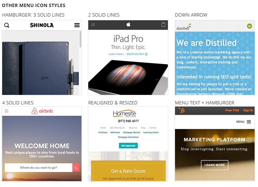
My next question: How large is the site? How many pages and subpages am I dealing with? This is also a fairly easy question to answer. Just look at the number of pages you are working with. For me, I tend to use menu as text that has been realigned and resized when I am only dealing with a few pages. But if the website has a lot of pages and subpages then I typically hide the navigation under an icon. The most common icon is the hamburger menu icon, three solid lines. But Apple has also been known to use two solid lines to signify a hidden menu and there are a few other options out there. Such as an arrow or “menu” as a text.

The last topic also brings up my third question: If the navigation is hidden under an icon, will the user be able to figure out how to find it? This is why I used the hamburger icon as an example above because it has become a staple in website and app design for signifying a hidden menu. I tend to stay with the masses on this topic since you wouldn’t want someone getting lost on your homepage with nowhere else to go. But if you’re afraid of this happening you can always use the word “menu” placed next to the hamburger icon. Or you could even use the word “menu” on it’s own.
My last question group is a big one: Can any content or links in the navigation area be removed to improve the navigation? Or should any content or links be added? Ex: search form, phone number, etc. Sometimes it’s important to simplify your navigation on the mobile side of things. You don’t want to overwhelm the screen with too much information. So it’s been common to hide unnecessary pages. But it’s also been common to add a search form, phone number, or additional page links. So you’ll really need to determine these on a case-by-case basis. If removing pages to simplify is the best direction to go, or your website has a small site map then I would choose a toggle/slide down menu. A toggle/slide menu pushes your page content down to reveal the menu links above the content but below the page header. A full or partial screen menu overlaywould also be a good option here. This is typically a colored background that is placed over 60% or more of the screen.
If you’re looking to add to your navigation then I would definitely choose a toggle/push menu from the right or left side. A toggle/push menu, pushes the content to the right or left and reveals the navigation to the side of the content. Either of these options works great for websites with a lot of pages and subpages.

Responsive Menu Examples
Below you will find live example from some of our favorite companies. Hopefully these examples will help you determine the best navigation for your website in the future.
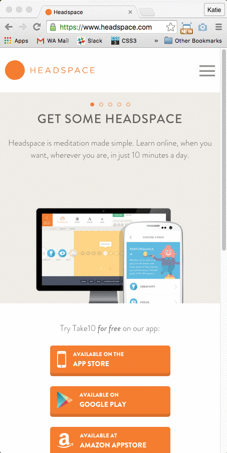
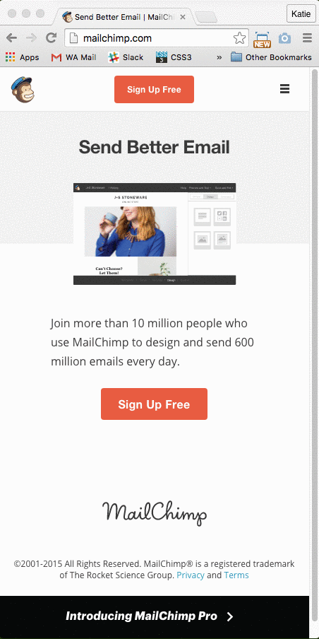
Realigning and Resizing A simple method for mobile navigation is to realign and resize page links. This can be accomplished by using media queries and css to make the menu fit at different media and device sizes.
 |
 |
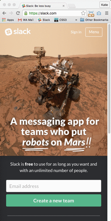
Toggle/Slide Down Menu A toggle/slide menu pushes your page content down to reveal the menu links above the content but below the page header. It also possible to have the slide down menu slide over content area. Both examples are shown below:
 |
 |
 |
Menu Overlay A menu overlay typically covers the entirety or majority of the screen giving you lots of space for your menu items. Examples are shown below:
 |
 |
 |
Toggle/Push Menu A toggle/push menu, pushes the content to the right or left and reveals the navigation to the side of the content. Examples are shown below:
 |
 |
 |
Have you seen any great mobile navigation trends or examples lately? Let us know below!